ClimateData.ca has undergone a major redesign to make it easier than ever to find, understand, and use high-quality climate data. Meet the Updated ClimateData.ca.

Meet the Updated ClimateData.ca

An easier way to access, visualize & download climate data

Date September 12, 2025
Author ClimateData.ca
Topics New and Noteworthy
Share this post


Introduction

ClimateData.ca has undergone a major redesign to make it easier than ever to find, understand, and use high-quality climate data in your work.

Whether you’re a long-time user or visiting for the first time, this update introduces powerful improvements—based on direct feedback from practitioners across Canada.


What has improved?

ClimateData.ca has undergone a major update to enhance usability and clarity—without compromising the depth and quality of the data. Highlights include:

  • Easier navigation – The site menu has been simplified, with core functions now integrated into three areas: Maps, Download, and Learning Zone. Sector filters, variable search, and regional selection are now built directly into these tools.
  • Lower barriers for non-experts – New help text and tooltips throughout Maps and Downloads explain what each variable means and why it matters. Users unfamiliar with climate data can explore confidently.
  • A better download tool – The previous Download and Analyze pages have been combined into a single workflow. More on this below.
  • Mobile-friendly design – The platform now works more smoothly across different screen sizes and devices.
  • Future-ready infrastructure – Major upgrades behind the scenes will support faster integration of new datasets and evolving user needs.

Who should use ClimateData.ca?

In short, anyone whose work is influenced by climate. While climate data is often associated with emergency planning and infrastructure design, it also supports work in agriculture, health, finance, transportation, and more. Whether you’re planning stormwater systems, choosing crops, or designing heat-resilient buildings, reliable climate data is essential.

ClimateData.ca was built to reduce barriers—so users can access authoritative data without the cost and complexity of doing it alone. Backed by Canada’s leading climate science organizations, the platform provides tools and guidance to support sound decisions across sectors and regions.

How to use our improved tools


A more complete Learning Zone

Go to the Learning Zone →

The Learning Zone is ideal for building climate literacy. It contains foundational knowledge on climate change and climate science, as well as practical guidance on applying climate data to real-world decisions.

Material from the former Sector Modules is now integrated into the Learning Zone, and new filters make it easy to browse by topic or sector (e.g. agriculture, buildings, health, marine).


Whether you’re building your climate literacy or applying data to a project, the Learning Zone is a great place to start.

An all-new Maps interface

Go to Maps →

We’ve built powerful customization features into the Maps tool, making it easier to focus on the data most relevant to your work. We’ll walk you through the steps—from choosing a dataset to exploring projections by region—so you can make the most of what the map has to offer.


1. Select the right dataset

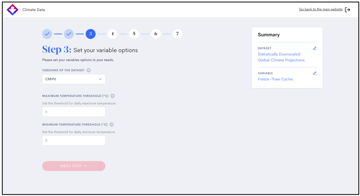
First, you’ll choose a dataset—such as the Statistically Downscaled Global Climate Projections. Each dataset contains one or more variables, which are specific indicators of climate conditions. For example, the Statistically Downscaled Global Climate Projections dataset includes more than 45 variables, such as Hottest Day, Freezing Degree Days, Frost-Free Season, and Cooling Degree Days, allowing users to explore projected changes under different emissions scenarios.

Other datasets contain fewer variables, each tailored to specific purposes. The MSC Station Normals dataset, for example, includes just three variables: maximum temperature, minimum temperature, and precipitation, representing historical averages over a 30-year period. These are commonly used for baseline comparisons or to contextualize extreme events.

Some variables are unique to specific datasets. For instance, Relative Sea-Level Change and Vertical Allowance are only available within the Marine Projections dataset.


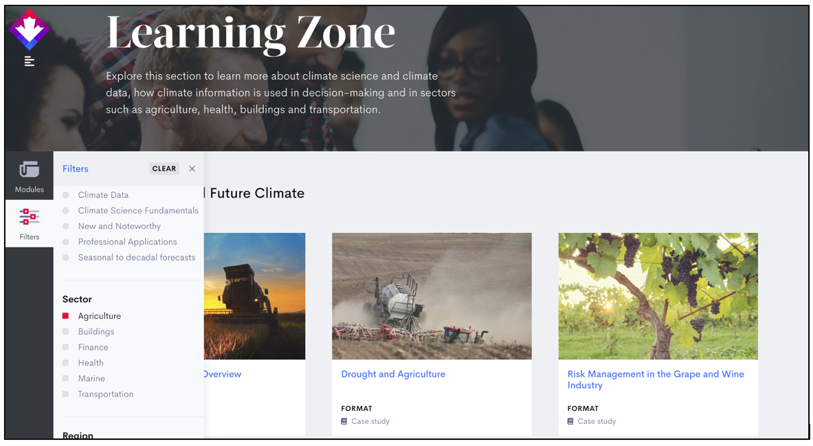
2. Find the right variables

It’s easy to find variables that suit your needs. You can search by keyword or browse by variable type or sector, such as agriculture, buildings, finance, health, marine, or transportation. More sectors will be added in future updates.

Once a variable is selected, you can further customize the map by exploring different:

  • Time periods – such as 2021–2050 or 2071–2100 when browsing future climate projections, or 1991-2010 when looking at recent climate normals
  • Emissions scenarios – based on the latest Shared Socioeconomic Pathways (SSPs) or the previous-generation Representative Concentration Pathways (RCPs). You can also compare emissions scenarios by checking the “Compare Scenarios” box,  which will display two maps, each using your selected scenarios, side by side.
  • Temporal frequencies – such as monthly, seasonal, or annual values


3. Explore maps by geography and interactive regions

You can also focus your view geographically. Our interactive maps can be divided into predefined regions. For most variables, you can explore data for:

  • Grid cells – small squares representing specific points on the map
  • Census subdivisions – administrative municipal boundaries
  • Health regions – areas aligned with public health planning
  • Watersheds – hydrological drainage areas

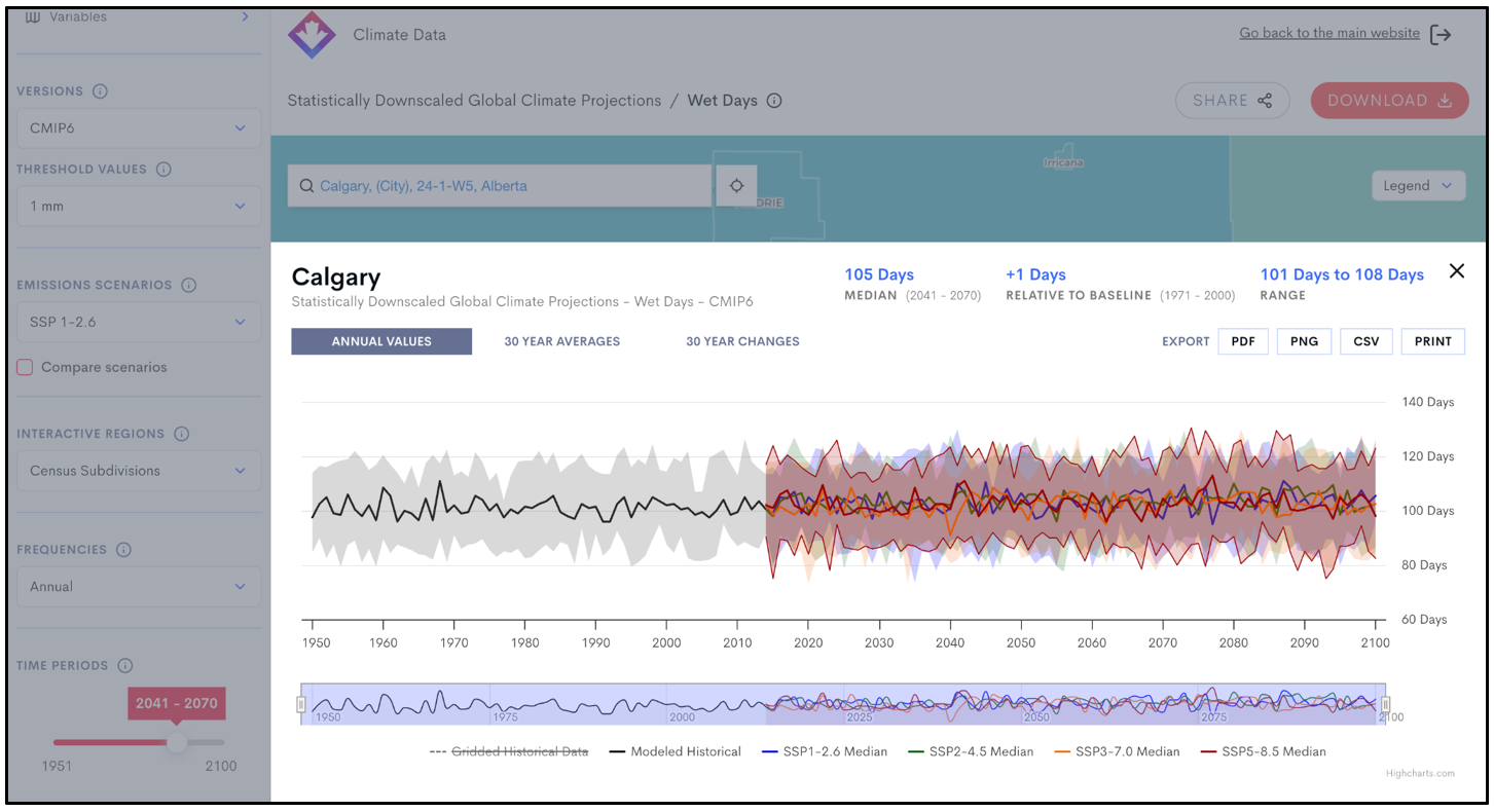
In Maps, clicking on a region will show its Median and Range values.


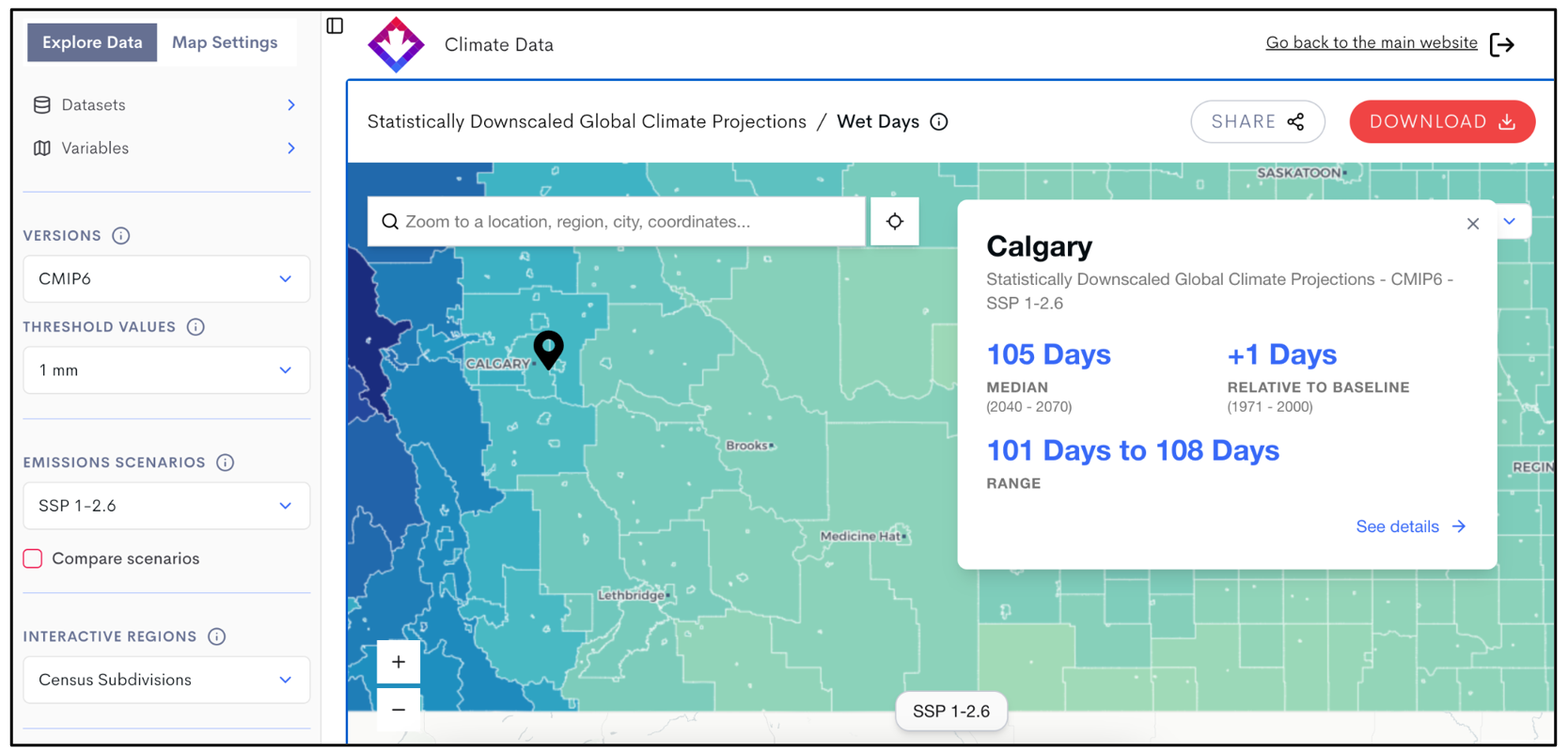
Click ‘See details’ for more information about the area, including interactive graphs.


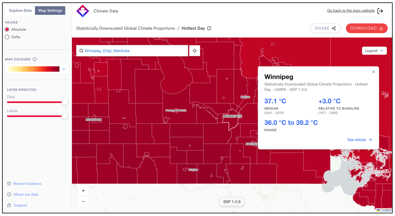
4. Compare future projections and past data using Map Settings

You can use Map Settings to choose between two data viewing options: Absolute and Delta. For example, when examining the Hottest Day variable for Winnipeg:

  • Absolute displays the actual projected value, for example, a median projected hottest day of 37.1 °C.
  • Delta shows the difference between the projected value and a historical baseline, indicating that the projected hottest day in Winnipeg is between +1.9 °C and +6.0 °C warmer than the actual 1971–2000 average, resulting in a median projected +3.1 °C increase in the hottest day temperature.

Use Absolute when you need specific planning values, and Delta when you want to understand how much the climate is projected to change over time.


A streamlined way to download and analyze data

Go to Downloads →

The new Download page merges the previous download and analysis tools into a single, streamlined interface. This tool walks you through:

  • Selecting a dataset and one or more variables
  • Choosing your region or station via map or search
  • Defining filters such as time period, scenario, percentile, and frequency
  • Exporting results in CSV, NetCDF, or JSON format

The new download tool also supports custom threshold analysis. This means you can calculate:

  • The number of days above a custom-defined temperature (e.g. >32°C instead of a default threshold)
  • Freeze-thaw cycles using thresholds you specify (e.g. crossing 0°C in a single day)
  • Degree-day accumulations using a base temperature of your choice (e.g. 5°C or 10°C, depending on crop needs)


These options enable tailored risk analysis and planning, whether you’re evaluating crop suitability, infrastructure durability, or health-related thresholds.

Precalculated data is available for immediate download. Custom queries are processed in the background and typically delivered to your inbox within 30–90 minutes.

Ways to find knowledge and support

The help text in Maps and Download can help you understand the tools as you use them—look for the information icon: ⓘ.If you get stuck or can’t find the information you need, contact our Support Desk. We’ll put you in touch with a Climate Services Support Desk Officer with expertise in climate information.