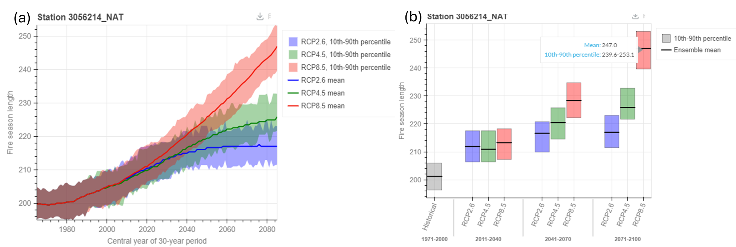
Figure 4: Fire Season Length (or number of days per year with measurable fire danger) projections for Station 3056214_NAT (Waterton Lakes National Park, Alberta) from 1971-2000 to 2071-2100.
a) Time-series plot: This time series plot shows the length of the fire season. For each emissions scenario (RCP), the solid lines show the ensemble mean value, so half of the climate model results fall below this line and half of them are above this line. The shaded area around each line shows the range of the ensemble 10th percentile (10% of model results fall below this value) to 90th percentile (90% of model results fall below this value). All values are shown as smoothed 30-year running averages. 30-year averages are often used to ensure that the data reflects the overall climate and not the more variable experience of weather.
b) Bar plot: This bar plot shows the length of the fire season. For each time period and RCP (emission scenario), the bold black lines indicate the ensemble mean. Half of the climate model results fall below this line and half of them are above this line. The ranges of blue, green, and red boxes represent the ensemble 10th percentile (10% of model results fall below this value) to 90th percentile (90% of model results fall below this value) for RCP2.6, RCP4.5, and RCP8.5, respectively.
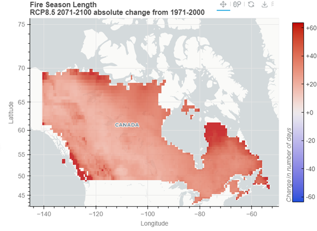
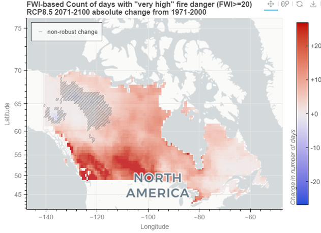 Figure 2: This map indicates that by 2071-2100, under a high emissions scenario, most regions in Canada are projected to experience an increase in the number of days with “very high” FWI danger. Parts of Western Canada could see up to 41 additional days with “very high” fire danger, while Eastern Canada is expected to experience an increase of 1 to 5 days of “very high” fire danger.