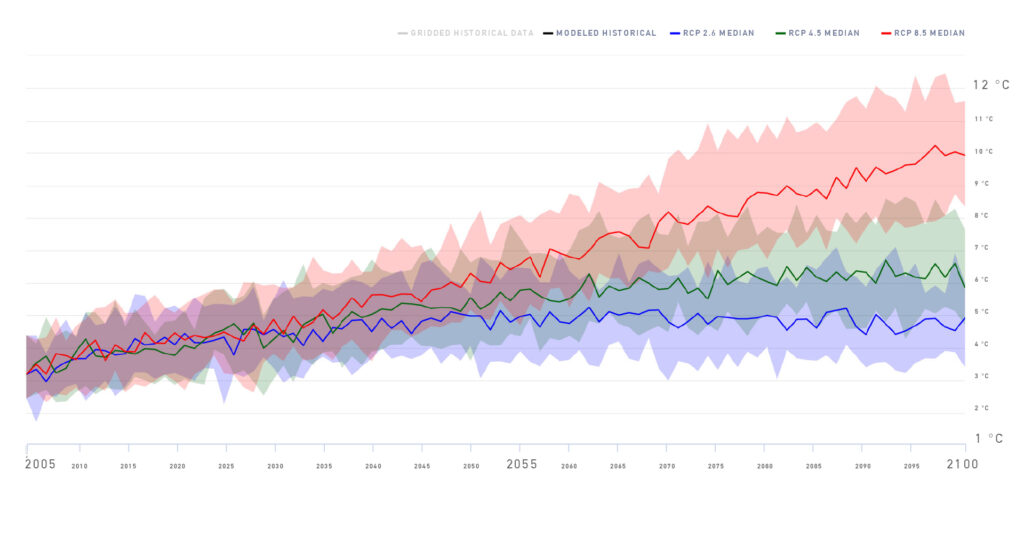
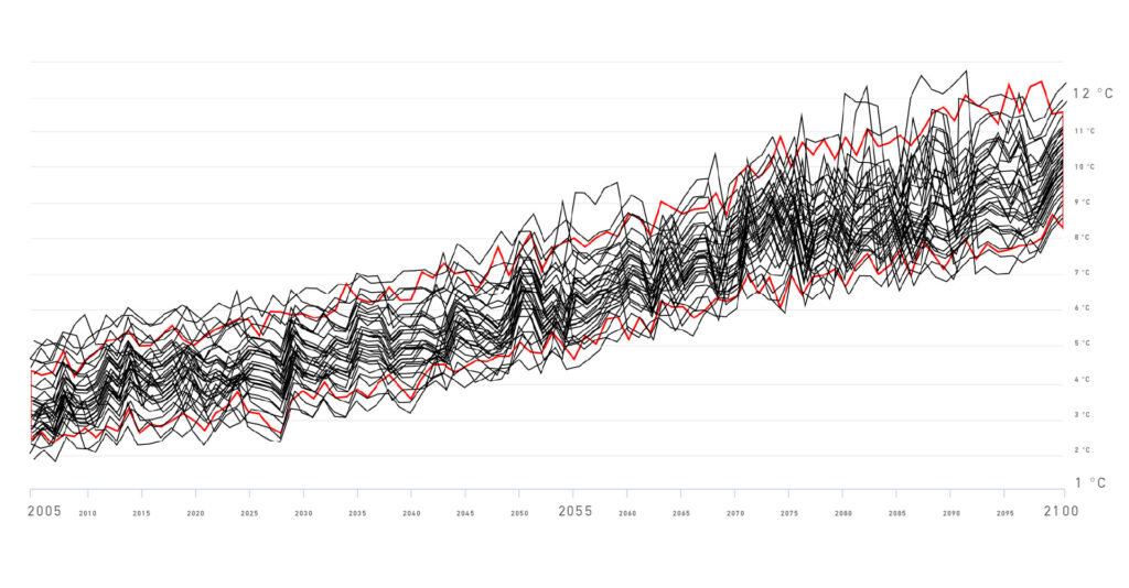
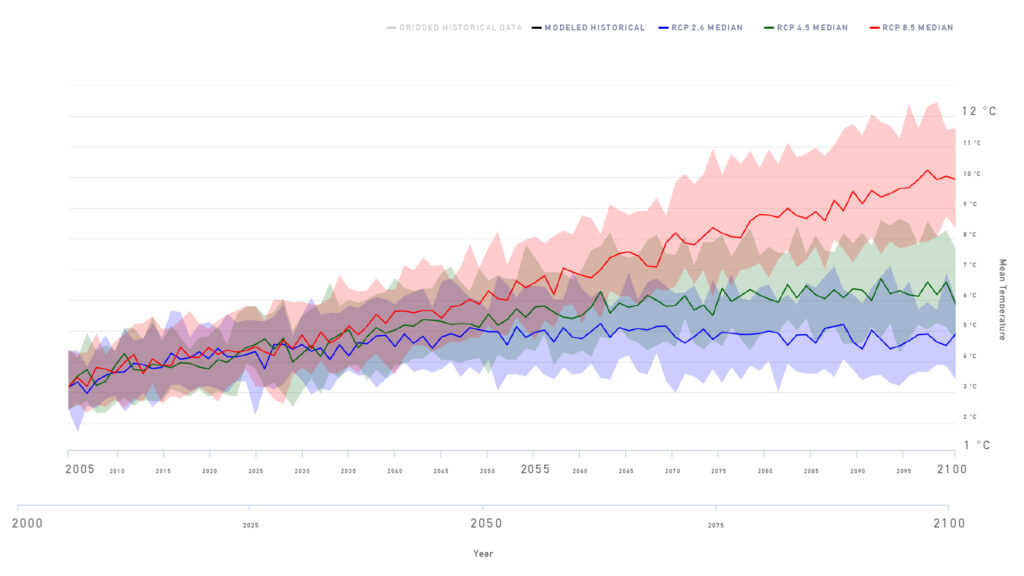
This graph was produced from an ensemble of 24 different climate models that have been developed by research groups from around the world and then run for 3 different scenarios represented by the shaded areas (blue: RCP 2.6; green: RCP 4.5; red: RCP 8.5).
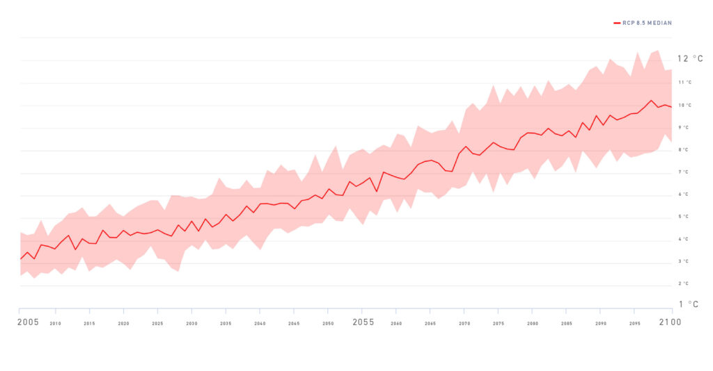
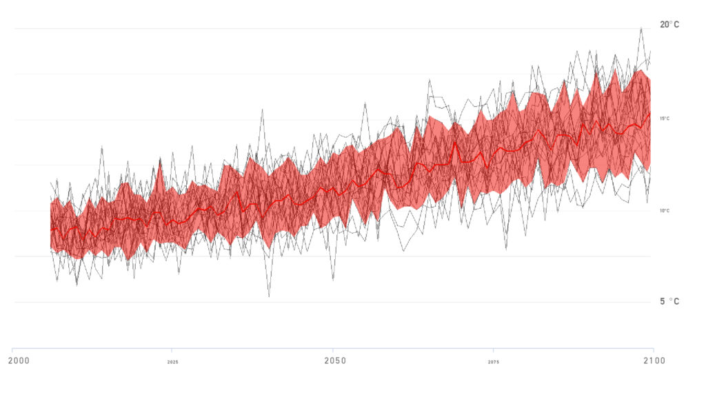
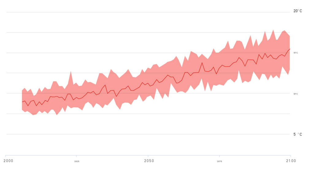
To explain further, let’s reconstruct our graph from the ground-up focusing first on the High Emissions Scenario, also known as RCP 8.5.
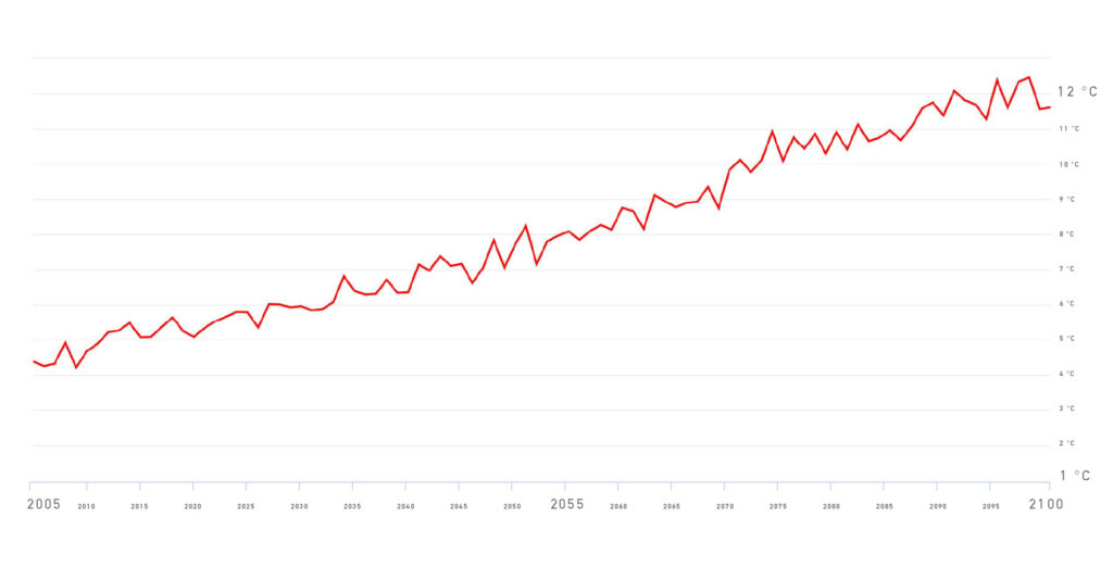
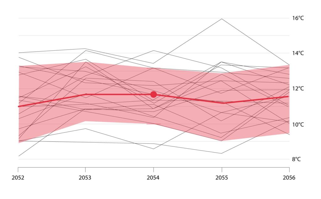
Each scenario is made up of many models. Here is the result from a single climate model, which projects around 10°C of warming by 2100 under a high emissions scenario.
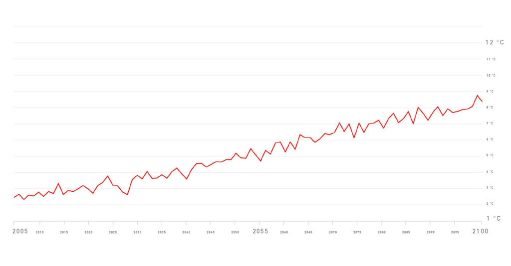
This model projects around 4.5°C of warning by 2100 under a high emissions scenario.
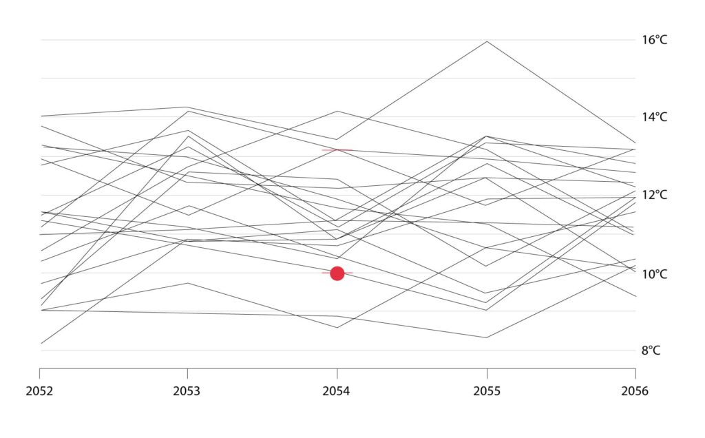
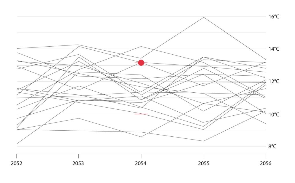
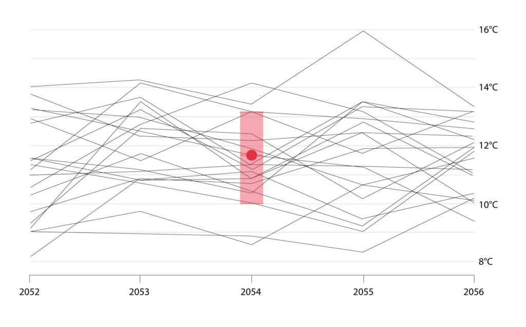
Those were extreme examples at the top and bottom of the range of model outputs. The full ensemble of model results fall somewhere in between.

