Understanding Multi-Model Ensembles

Learn why ClimateData.ca uses an ensemble of 24 climate models to get a better grasp of what the future may look like.

Time to completion
5 min

Why should I use more than one model?


The future is uncertain, and we don’t know exactly what it will look like. As explained in our article on model uncertainty, the main causes are: not knowing how greenhouse gas emissions may evolve in the future, how models simulate natural climate variability (known as internal variability) and inter-model differences.


All climate models are mathematical representations of the real climate system. While all climate models use well-established physical principles to simulate the climate, each model uses slightly different approaches, which produce inter-model differences. Each model has different strengths and weaknesses. For example, models may use different spatial scales, which affects how well they represent topography. There is also variation in model parameters (e.g., how clouds are represented in the model).

Here we’ll explain why it’s recommended that multiple models, known as an ensemble, be used to get a better grasp of what the future may look like.

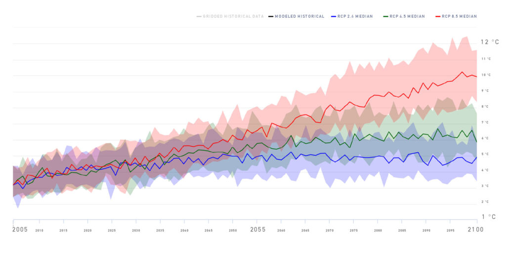
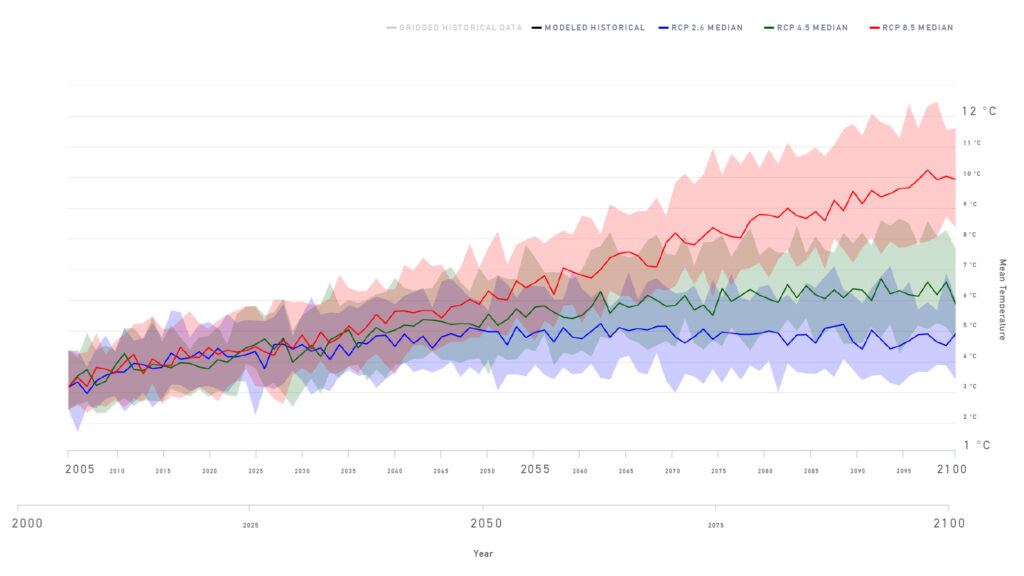
This graph was produced from an ensemble of 24 different climate models that have been developed by research groups from around the world and then run for 3 different scenarios represented by the shaded areas (blue: RCP 2.6; green: RCP 4.5; red: RCP 8.5).

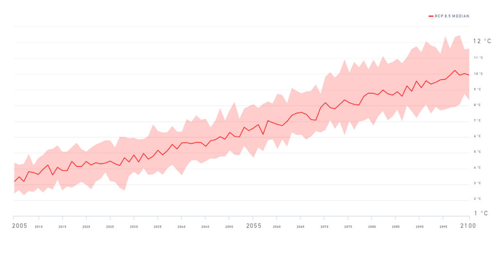
To explain further, let’s reconstruct our graph from the ground-up focusing first on the High Emissions Scenario, also known as RCP 8.5.

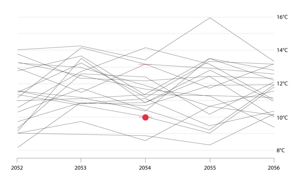
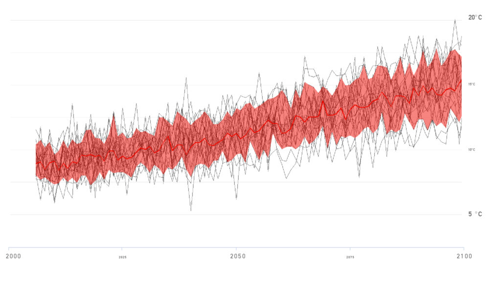
Each scenario is made up of many models. Here is the result from a single climate model, which projects around 10°C of warming by 2100 under a high emissions scenario.

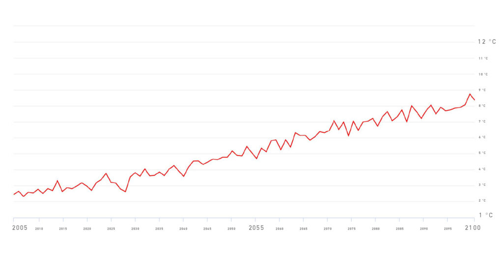
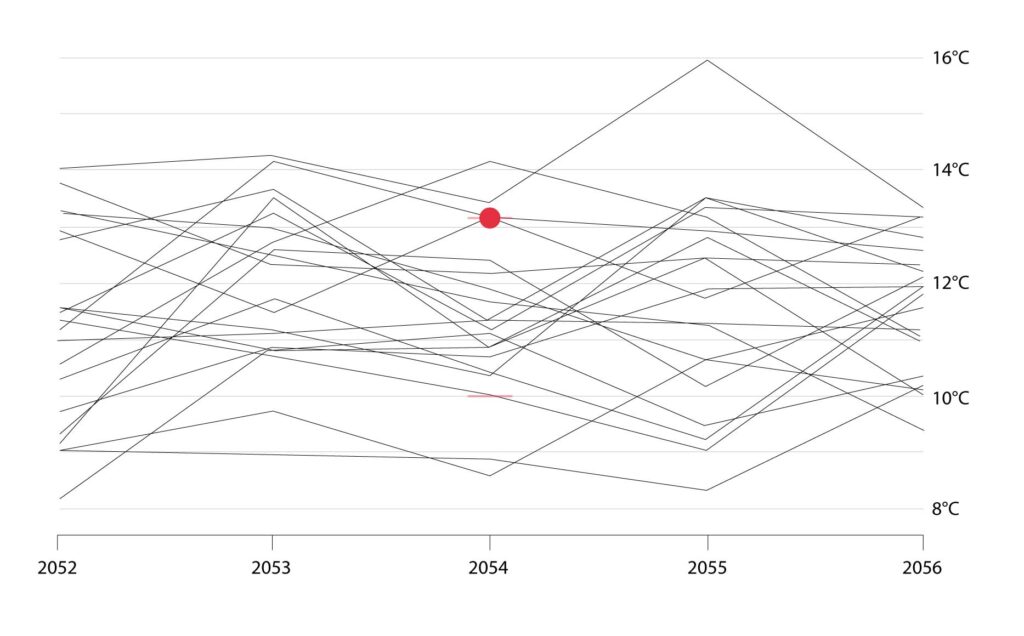
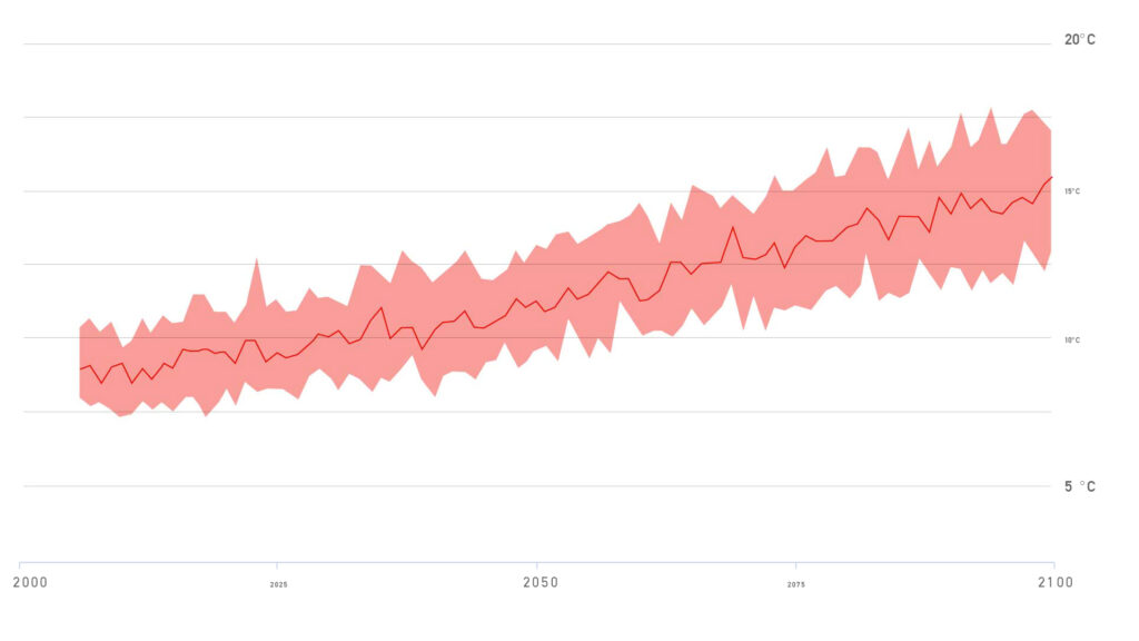
This model projects around 4.5°C of warning by 2100 under a high emissions scenario.

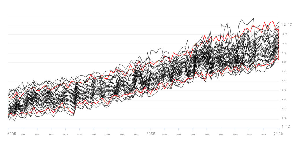
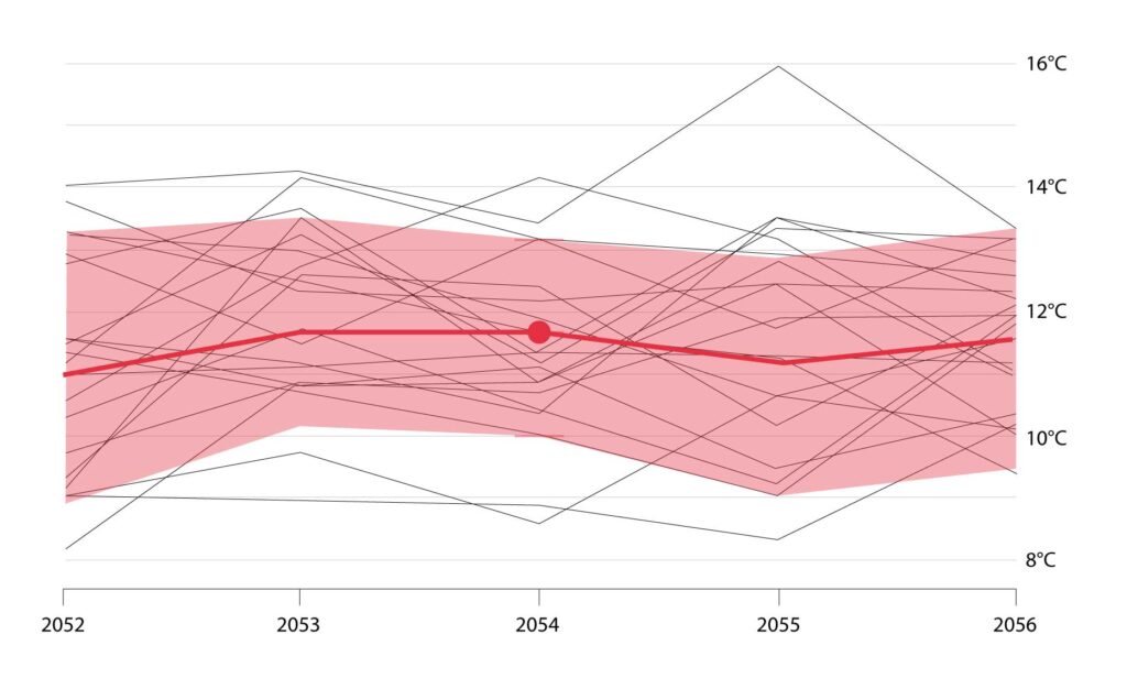
Those were extreme examples at the top and bottom of the range of model outputs. The full ensemble of model results fall somewhere in between.

So which model should we choose?

Unfortunately, there is no “best” model. Each model is a unique and sophisticated mathematical representation of the climate system. Therefore, on ClimateData.ca we use an ensemble of models.

Percentiles are used to help show us where the bulk or majority of the model results fall, and to allow us to ignore the outliers. Model results are also called outputs or simulations, because they are simulating the climate.

To explain, let’s take a closer look at an individual year.

We can identify the “10th percentile” value. That is, 10% of the model simulations are less than, or equal to, this value.

We can also identify the “90th Percentile” value. 90% of the model results are less than, or equal to, this value.

Most of the models fall between the 10th and 90th percentile. We can then calculate the “50th percentile”, or median, where half of the model results are below, half above.

These percentiles can then be calculated for all years.

Now let’s zoom back out to see the entire time series. We can see all models (black lines), the range of models that fall within the 10th and 90th percentiles (light red range), and the ensemble median (red line).

For simplicity, we can remove all the individual models and just show the 10th and 90th percentile range as well as the ensemble median.

This approach is applied to the other two emissions scenarios on ClimateData.ca (green for RCP 4.5 and blue for RCP 2.6) as you will see when exploring any of the data and indices available on ClimateData.ca.

When incorporating climate projections into decision-making, it is important to use a set of climate model results to ensure you are prepared for the range of possible future climates.

See our videos on incorporating climate information into decision-making for more information.

For more information on the impacts of climate change in Canada, see Canada’s Changing Climate Report.

For any questions about using climate data and information, please contact the Climate Services Support Desk.