The ClimateData.ca partners take design seriously. One aspect of design we have been paying particular attention to recently is the way data is presented on maps. Choosing the right colours to represent data on these maps may seem like a simple task, but it actually requires careful consideration, especially when dealing with scientific data.
We would like to invite you to join us in this process by taking our interactive colour quiz. This quiz will not only test your perception of colour but also ask you to choose your favorite colour options. By participating, you will be helping us improve the way data is presented on the website. So, are you ready to dive into the world of colour?
First, some background: why are we considering changes to the colours on our maps?
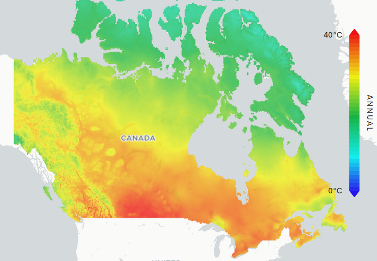
Take a look at this ClimateData.ca map, which shows the average hottest temperature Canadians can expect to witness in any given year. This map uses a rainbow colour ramp – red, orange, yellow, green, and blue. The end result looks nice. However, there are several readability issues brought about by the use of the rainbow colour ramp.
For one, take a closer look at the regions coloured yellow. Do you notice how the yellow colour seems to form a sharper border compared to all other colours? Our eyes are somehow drawn to the yellow; it seems to almost be more important than the greens and oranges. In fact, the jump from yellow to green or from yellow to orange is a very large jump in luminance – or the perceived brightness of the colour – making it appear to the reader that the temperature on the map also drops off steeply, which is not the case here.
Is there a better choice for a colour ramp?
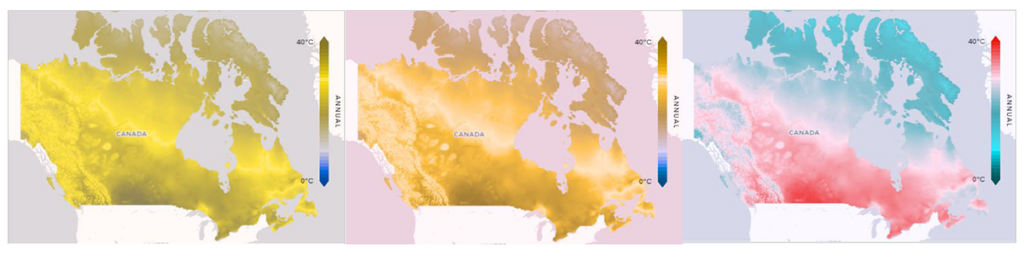
Many experts have identified an alternative that is considered a superior option: the Bartlow colour ramp. Bartlow, also known as “the scientific rainbow,” has been shown to be objectively superior to the rainbow colour ramp in terms of its effectiveness in representing data. However, it should be noted that the Bartlow colour ramp may not be as visually appealing as the rainbow colour ramp, and it’s important to consider the context and audience when choosing a colour ramp.
Let’s face it: humans judge a book by its colour ramp. When it comes to effectively communicating scientific information to the general public, it is important to strike a balance between aesthetics and accuracy. Maps, in particular, need to be visually engaging while also being easily readable and understandable at a glance. While human intuition can be a useful tool in some cases, such as associating red with heat, it can also lead to confusion and misinterpretation when applied to other data sets.
This is where we need your help
We want to learn more about how you, hopefully a user of ClimateData.ca’s interactive map data visualization products, perceive and interpret colours. We have assembled a short quiz below that will test your colour preferences for several climate change related variables. After entering your answers, scroll to the bottom for the live poll results. Are you surprised by any of the answers? Please also share this with your friends and co-workers, and thank you in advance for your help.
Important note: the polling system we are using will ask for your permission. Depending on your browser, it may ask again for all of the questions. To avoid having to click ‘accept’ many times, you can simply refresh this page after granting permission the first time.
What if you are colour blind? Should you still take this quiz? Absolutely. Seeing how your answers compare and contrast with others will provide us with further evidence for determining which colours to use, or avoid, in the future.
Want to see how others responded?
Thank you for your responses! Are you curious how your answers compared to others? Scroll down a bit further to see the live poll results.