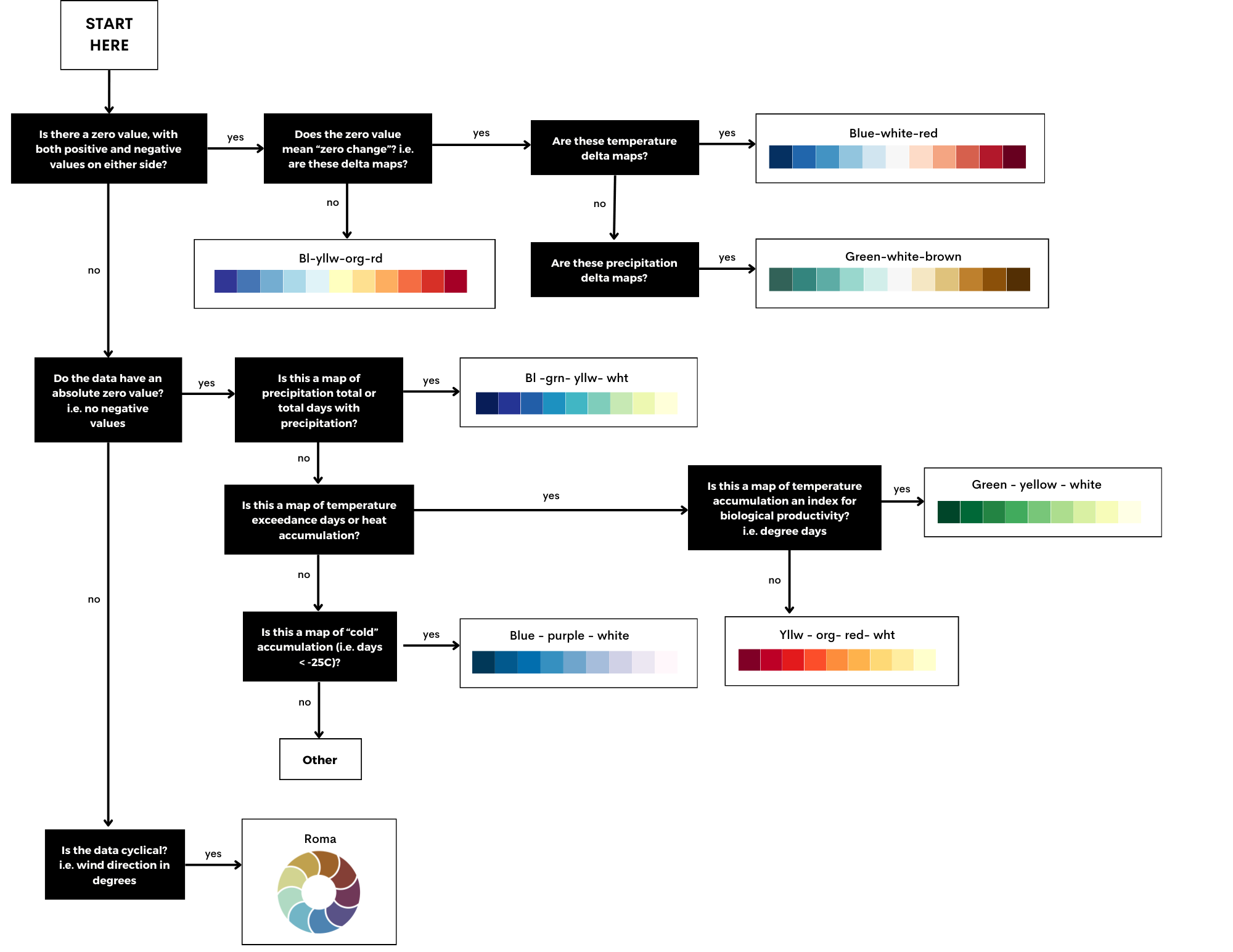
Before exploring the colour ramp decision tree, it is worth revisiting some colour theory first introduced in ClimateData.ca’s February 2023 “colour perception” article. Back then, ClimateData.ca relied heavily on the use of the “rainbow” colour ramp for most of its temperature-based maps. The rainbow colour ramp, with its vibrant spectrum from red through blue, has long been a staple in data visualization for its aesthetic appeal. However, this approach hides several pitfalls that can obscure or distort the data it aims to represent.1
One notable issue, which was demonstrated in the previous article by converting the maps into greyscale (Figure 2), is the variable luminance across the spectrum, which can create misleading impressions of data gradations. For example, the transition from yellow to green involves a jump in perceived brightness, suggesting a more abrupt change in the underlying data than actually exists.
How the IPCC colours its maps
The IPCC’s design guide is a vital tool for translating complex climate data into clear, accessible visualizations. Developed for the Sixth Assessment Cycle, it incorporates advice from cognitive scientists and designers to ensure visuals are both engaging and scientifically accurate. This guide updates previous versions with new research, aiming for consistency across chapters and clear communication of key messages. It underscores the IPCC’s dedication to making climate change science understandable and actionable for wider audiences.2


