The Science and Art of Colour in Climate Mapping

Data visualization plays a pivotal role in communicating complex climate change information in a manner that is both accessible and engaging to the public. At the heart of this challenge lies the selection of colour ramps for climate maps—a decision that balances scientific accuracy with visual clarity and inclusivity. ClimateData.ca’s approach to this task is encapsulated in the “colour ramp decision tree” below, which serves as the site’s blueprint for creating maps that are informative, accessible, and aesthetically pleasing.

What are colour ramps?
Colour ramps are a continuous succession of colours – a gradient – representing a set of values.

The choice of colour ramp is not merely a technical decision but also a design decision, sometimes requiring a balance between scientific rigour and visual appeal. Maps must captivate the audience’s attention while conveying complex data in an understandable way. They must also be readable and avoid using colours that may convey an unintended message. Existing associations that an audience may have with a particular colour can influence how they perceive the information being communicated on a climate data map. For example, the colour blue can imply that some value is declining over time, or it can be used to show regions that have a large number of very cold days per year, or it can be used to show regions that have high average total precipitation (Figure 1). We are grateful to all who responded to our Colour Quiz from last year to inform our thinking about how our audience perceives colour concepts.

Figure 1: Examples of new colour ramps on ClimateData.ca with a focus on the colour blue

Drawing on the Colour Quiz responses and best practices in the field of climate data visualization, ClimateData.ca’s approach recognizes the power of aesthetics in engaging the public without compromising the scientific accuracy essential for informed decision-making.

The Rainbow Ramp: Why ClimateData.ca needed new map colours

Before exploring the colour ramp decision tree, it is worth revisiting some colour theory first introduced in ClimateData.ca’s February 2023 “colour perception” article. Back then, ClimateData.ca relied heavily on the use of the “rainbow” colour ramp for most of its temperature-based maps. The rainbow colour ramp, with its vibrant spectrum from red through blue, has long been a staple in data visualization for its aesthetic appeal. However, this approach hides several pitfalls that can obscure or distort the data it aims to represent.1

One notable issue, which was demonstrated in the previous article by converting the maps into greyscale (Figure 2), is the variable luminance across the spectrum, which can create misleading impressions of data gradations. For example, the transition from yellow to green involves a jump in perceived brightness, suggesting a more abrupt change in the underlying data than actually exists.

How the IPCC colours its maps

The IPCC’s design guide is a vital tool for translating complex climate data into clear, accessible visualizations. Developed for the Sixth Assessment Cycle, it incorporates advice from cognitive scientists and designers to ensure visuals are both engaging and scientifically accurate. This guide updates previous versions with new research, aiming for consistency across chapters and clear communication of key messages. It underscores the IPCC’s dedication to making climate change science understandable and actionable for wider audiences.2

Figure 2: Excerpts from “Take our colour quiz: help us choose the best colours for our maps and data” demonstrating the limits of converting rainbow colour ramps to greyscale

Furthermore, the rainbow ramp’s effectiveness diminishes when viewed by individuals with colour vision impairments. This limitation not only affects the map’s readability but also its inclusiveness, potentially alienating a segment of the audience who cannot fully perceive the intended contrasts and transitions (Figure 3).

Variable luminance

Luminance is an indicator of how bright something will appear to a viewer. In the context of colour ramps, variable luminance refers to a perceived difference in brightness between colours, which may or may not align with the difference in values that the colours represent.

Figure 3: The images above simulate how people with extreme colour-blind issues may see this same map. From left to right: Protanopia (red-blind), Deuteranopia (green-blind), and Tritanopia (blue-blind).

The Colour Ramp Decision Tree

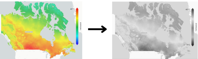
Following the IPCC style guide2, ClimateData.ca approached the transition from the traditional rainbow color ramp to alternative color palettes (Figure 4). The team used the online tool ColorBrewer.org to assess various color ramps, which includes the colour ramps recommended by the IPCC. ColorBrewer provides colour ramps that focus on colour distinctiveness and readability.

Figure 4: “Before and after” example of the new colour ramps on ClimateData.ca

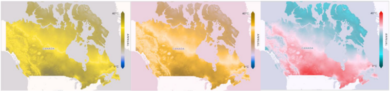
Subsequently, maps on ClimateData.ca underwent a kind of “story-telling” evaluation, focusing on the main points the maps are conveying and the types of colours the users expect to be tied to the different climatic changes being visualized. This involved assessing if the maps depict significant temperature changes and how these changes compare to recent historical data. It also assessed whether the visual cues, such as the color red, intuitively convey the desired meaning, such as indicating an increase in frequency or temperature, or possibly both. This “story-telling” evaluation resulted in the use of an additional colour ramp – blue-yellow-orange-red (Figure 5) to better represent some of the datasets provided.

Figure 5: The blue-yellow-orange-red colour ramp above was added to the decision-tree as a result of assessing the types of colours the users expect to be tied to the different climatic changes being visualized

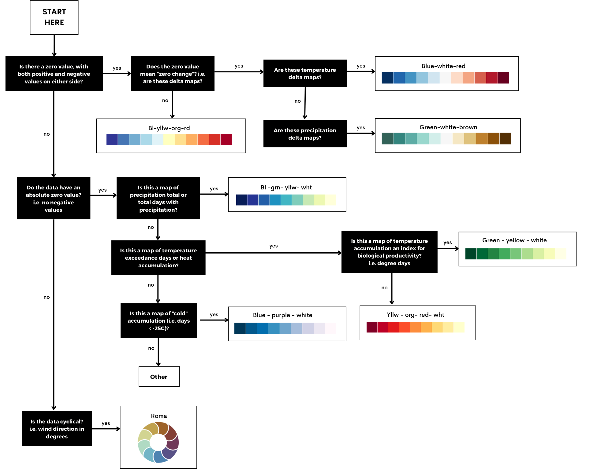
By carefully considering the benefits and drawbacks of each colour ramp from a readability and accuracy point of view, a final ‘colour ramp decision tree’ was produced.

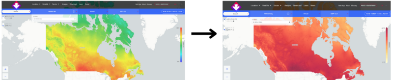
ClimateData.ca’s decision tree (Figure 6) for selecting colour ramps considers both the scientific integrity of data representation and the user experience. Almost always this constitutes a trade off, allowing the maps to be readable at a variety of scales while also trying not to mis-represent the data in any way.

The decision tree also emphasizes the importance of accessibility and inclusivity, advocating for colour schemes that are perceptible to individuals with various visual abilities. This attention to detail ensures that climate maps are not only accurate and informative but also more accessible.

Figure 6: Decision-tree for assigning new colour ramps on ClimateData.ca

Future improvements to ClimateData.ca’s maps

This evolution in map design reflects a broader commitment to enhancing public understanding of climate data, and our team is excited about what’s coming next. Soon, ClimateData.ca will be getting a major overhaul, with large improvements coming specifically to the mapping interface. Users will have the option to select different colour ramps and have the maps dynamically re-draw on the screen. In addition, we are also working on new applications that can generate Canada-wide maps on the fly using user-set maximum and minimum legend values. Powerful new cloud-based computing options are opening up all sorts of innovations, so be sure to check back in often so you can take advantage of these new tools in your line of work.


1 Scrap rainbow colour scales | Nature

2 IPCC_AR6_WGI_VisualStyleGuide_2022.pdf