All Variables

Below is a library of all variables available within ClimateData.ca. Use the filter to limit your search to specific types of data.

Key Messages

  • Historical Intensity-Duration-Frequency (IDF) curves are graphical tools that describe the likelihood of a range of extreme rainfall events. Environment and Climate Change Canada (ECCC) produces IDF curves using statistical techniques and records of past rainfall.
  • IDF curves are used by a wide range of professionals – including engineers, water resource managers, and urban and regional planners – to manage impacts and risks related to extreme rainfall.
  • Practitioners should understand how to use, read and interpret IDF curves before using them for decision-making.  They should also be aware of key challenges and limitations in measuring extreme rainfall and creating IDF curves, in order to avoid misuse.
  • Historical IDF curves alone cannot be used to assess future extreme rainfall conditions, which are expected to shift significantly over time due to climate change. Methods exist to scale historical IDF data to account for climate change. Climate change-scaled IDF data is provided on ClimateData.ca, as a station data variable.

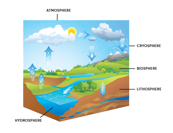
What are IDF Curves?

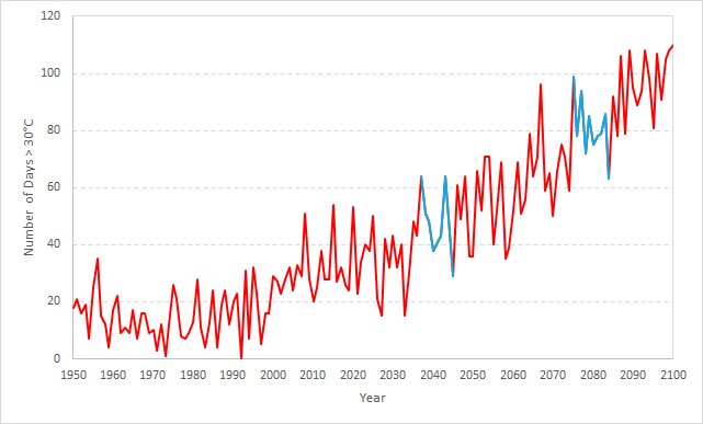
Intense precipitation events can deliver large amounts of rain over short periods of time. This rain, as well as related flooding, can overwhelm storm drains, flood basements, wash out bridges and roads, and trigger landslides. To reduce the risk of these impacts, engineers, hydrologists, planners and other decision makers rely on accurate information about extreme rainfall events. IDF curves are one important source of this information.

Three main elements are described in IDF curves:

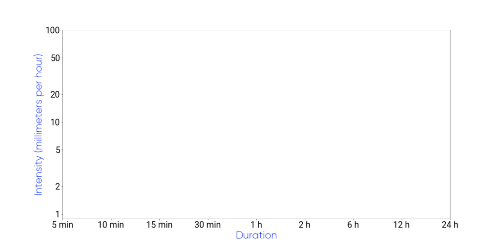
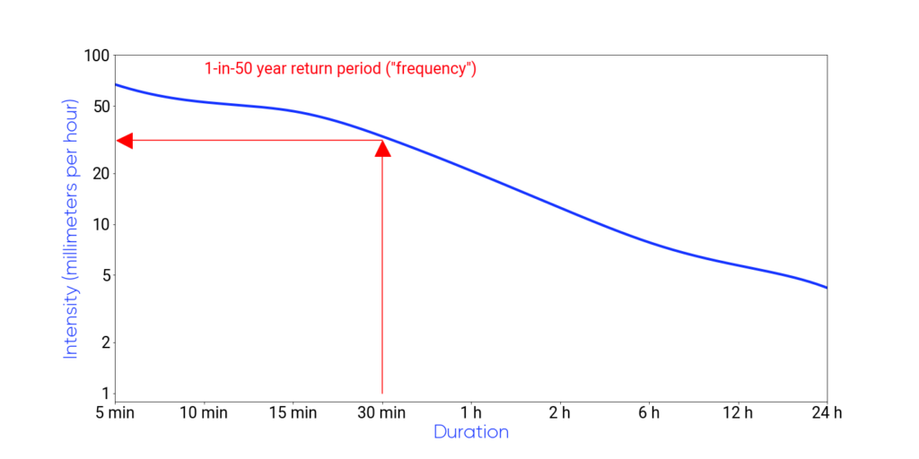
Duration: The period of time of interest. Typical IDF curves include extreme precipitation durations ranging from 5 minutes to 24 hours.

Intensity: The average rainfall rate over the specific duration of interest, in units such as mm/h.

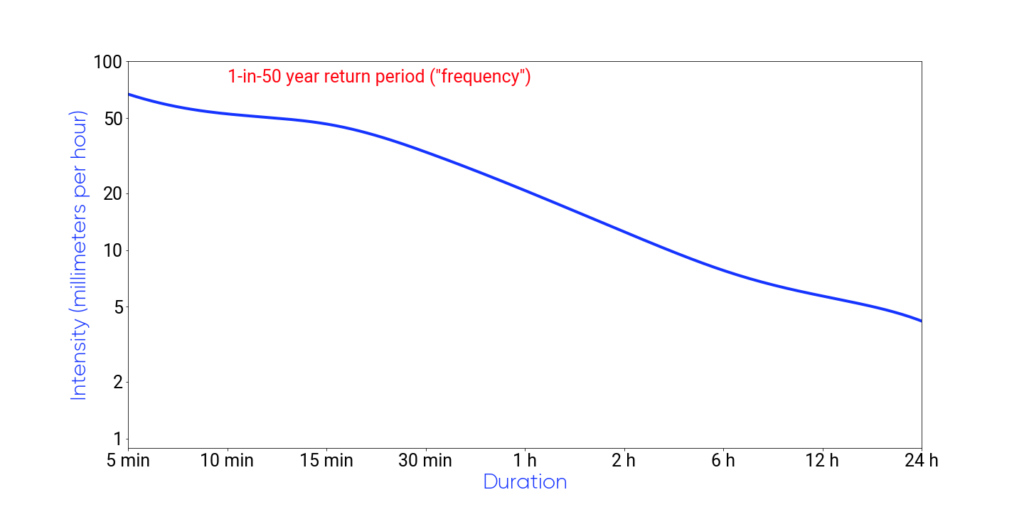
Frequency: To plan for extreme events of a specified duration and intensity, it matters how often such events occur.

This is often described as a return period, which is defined as how often, on average, the event is expected to occur. Frequency can also be thought of in terms of probability or likelihood. For example, an event with a 1-in-20 year return period will occur on average once every 20 years, and therefore has a 1-in-20, or 5%, chance of occurring each year.

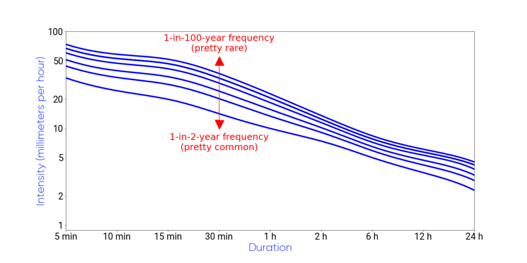
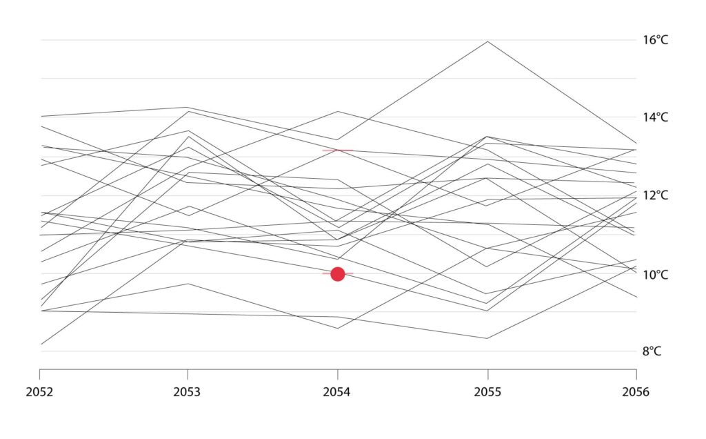
To use IDF curves, users can choose the rainfall duration (horizontal axis) and return period of interest (different lines) for their application, to determine the relevant rainfall intensity (vertical axis).

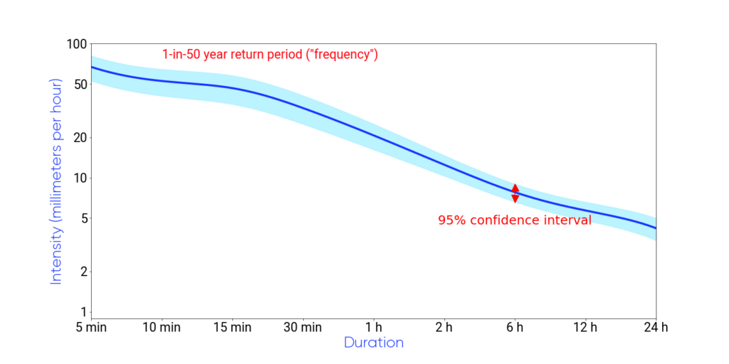
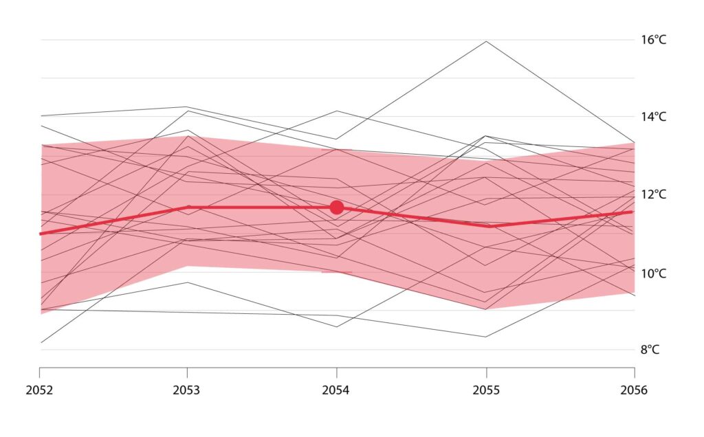
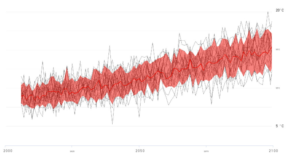
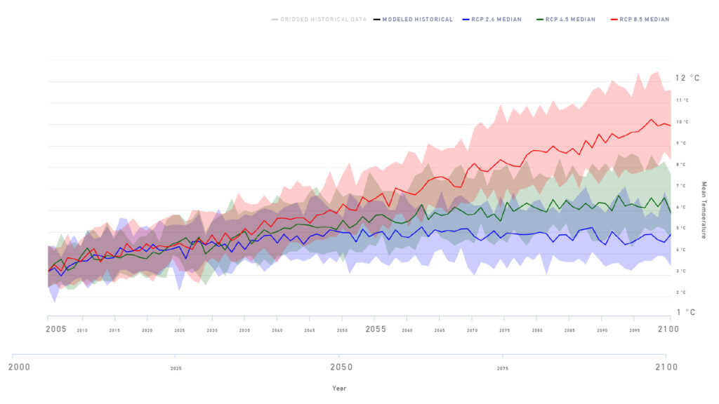
To help understand where data is most reliable, some IDF curves contain additional information known as confidence intervals, which describe the uncertainty in the IDF values that may arise from statistical chance. Simply put, users can trust that rainfall intensity values for a given duration and return period are likely to fall within the confidence interval that brackets the central IDF curve line.

Consider a 10 mm/hr rainfall intensity central value that is bracketed by a 95% confidence interval at 5 mm/hr and 15 mm/hr. This means that 95% of the time (19 times out of 20), the ‘real’ value of rainfall intensity for this duration/return period will fall between 5 and 15 mm – and, conversely, that there is only a 5% chance that the value will fall outside this range due to particularly abnormal storms or weather patterns.

It is important to note that this measure is a statistical one only and does not account for factors that have the potential to affect the IDF values such as decadal instrument errors, changes to station locations, climate variability, or long-term climate change. Other measures are taken to address each of these potential sources of uncertainty such as adjustment and homogenization of stations, using long time periods to derive IDF curves, and computing future projections of IDF curves.

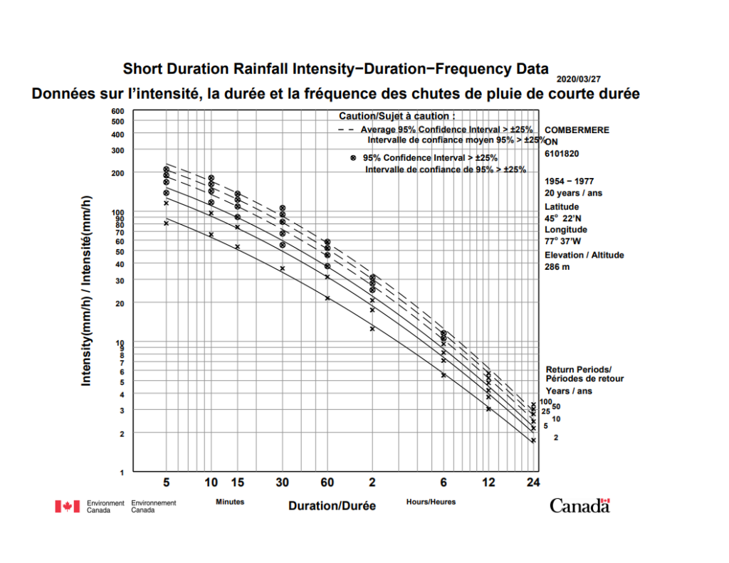
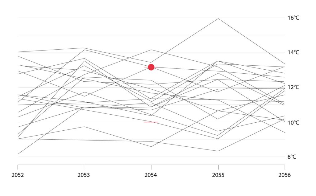
ECCC IDF curves represent confidence intervals in a very specific way.  Solid lines/crosses indicate that the 95% confidence interval for the curve/point in question is narrow – less than 25% of the central rainfall intensity value (in other words, uncertainty in the value is relatively low).

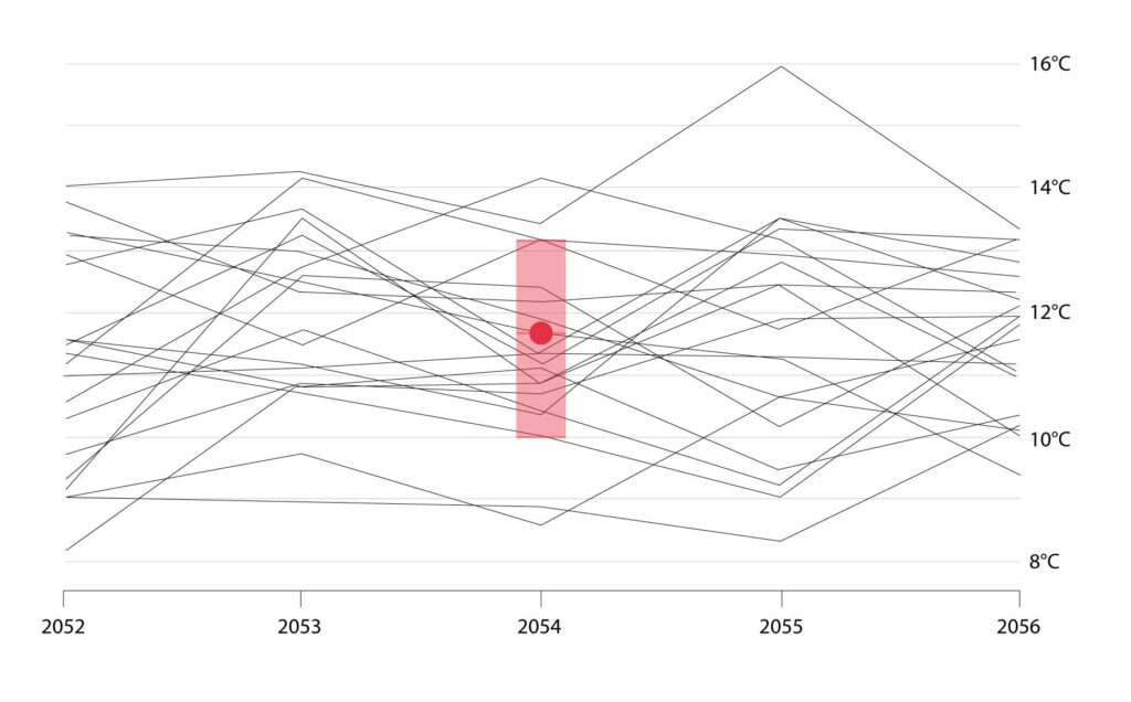
Conversely, dashed lines/circled crosses indicate curves/points where the 95% confidence interval is wide – more than 25% of the actual rainfall intensity value.  In this situation (which occurs more often for shorter durations, and longer return periods), the central value of rainfall intensity should be treated with relatively more caution.

How are IDF Curves produced?

IDF curves are produced using rainfall data that is collected by the Meteorological Service of Canada, ECCC. First, rainfall data is obtained from a weather station that is part of the national network operated by ECCC and housed in the National Climate Archive.

To record rainfall data, a weather station must be equipped with a tipping bucket rain gauge (TBRG) that can record rainfall amounts for periods as short as 5 minutes. This data is then carefully reviewed to ensure that, for example, it is not influenced by equipment malfunction, and that the data captures extreme rainfall events that is consistent with other station, radar and satellite data.

After the initial quality control work has been performed, the next step is to find the maximum rainfall amounts for each duration, and for each year. These values are referred to the as annual maximum series (AMS) of rainfall.  In the case of IDF curves provided by ECCC, IDF curves are only produced for stations that, after all review and data quality control is complete, have an AMS of rainfall that contain annual maximum values for 10 or more years (to learn more about this process visit the Engineering Climate Datasets).

In order to calculate extreme values for specific return periods, the AMS is fitted to the Gumbel extreme value distribution using the method of moments. In simple terms, this is just a statistical method to estimate extreme return period values from limited observational data.

Return period estimates correspond to rainfall event probabilities at a single location: the weather station at which the rain measurements were taken. They do not reflect rainfall amounts or rates over wider areas. Since IDF curves are based on the analysis of historical rate-of-rainfall data, they do not explicitly incorporate any projected future changes due to a changing climate.

Similarly, because of climate change, IDF curves based on very old historical data may not be valid for the present day. Finally, the term ‘return period’ should not be taken to imply that these extreme events recur on a regular, steady cycle. For example, the term ‘1-in-25 year’ rainfall does not imply that a rainfall of this magnitude occurs regularly every 25 years. Instead, it means that a rainfall event of this magnitude has a 1-in-25 (4%) chance of occurring in any given year. Indeed, it is possible to have 1-in-25 year events in consecutive years, or, not at all for 30 years.

Now that you have completed reading IDF Curves 101, you may be interested in Best Practices for Using IDF Curves.

For more information on the impacts of climate change in Canada, see Canada’s Changing Climate Report.

For any questions about using climate data and information, please contact the Climate Services Support Desk.

Why is there a range in climate model results?

The future is uncertain, and we don’t know exactly what it will look like. The main causes are: not knowing how greenhouse gas emissions may evolve in the future, how models simulate natural climate variability (known as internal variability) and inter-model differences.

Emissions scenarios allow us to view different ‘what if?’ questions to help us plan for the future.

Human activity is causing climate change but we don’t know exactly how humans will behave and how emissions of greenhouse gases will change in the future.

Emissions scenarios help us understand a range of potential futures based on different amounts of greenhouse gases.

The emissions scenarios that are currently in use on ClimateData.ca are called Representative Concentration Pathways, or RCPs.

They appear as three coloured bands in the graphs. 

So why are there multiple future emissions scenarios, or pathways?

These future pathways show us the different “what if?” results from different combinations of assumptions about:

Population Growth

Economic Activity

Energy Intensity

Socio-economic Development

Land Use Change

Climate Policy

Different combinations of these assumptions lead to different levels of greenhouse gas emissions. These emission scenarios are then used in climate models to simulate the climate response.

RCP 2.6

RCP 2.6 is the low emissions scenario where we limit human caused climate change. Carbon emissions peak almost immediately and then reduce to near zero before the end of the century.

It would mean an average global temperature increase of 1°C by the end of the century and 1.8°C in Canada.* This is roughly compatible with the goal agreed to in the Paris Agreement.

*compared to a baseline period of 1986-2005

RCP 4.5

RCP 4.5, a medium emissions scenario, shows us a future where we include measures to limit human-caused climate change.

This scenario requires global carbon emissions to stabilize by end of the century.

In Canada, RCP 4.5 would mean an average temperature increase of 3.2°C by the end of the century.*

*compared to a baseline period of 1986-2005

RCP 8.5

RCP 8.5, the high emissions scenario, shows us a future where there are few restrictions on emissions. Emissions continue to increase rapidly through this century, and only stabilize by 2250.

In Canada, RCP 8.5 would mean an average temperature increase of 6.3°C by the end of the century.*

*compared to a baseline period of 1986-2005

So why do we need these different emissions scenarios?

Past climate information alone is not sufficient to make decisions about the future. 

As you can see in most graphs in ClimateData.ca, the future will not look like the past (represented by the grey band).

Since we don’t know exactly how different the future will be from the past, there is no one-size fits all approach when deciding which pathways to select – it depends on a wide range of factors that are specific to the type of project, time horizon, etc.

Over the next 30 years, there is little difference between the RCPs.

However, looking further down the road, the pathway we are on is much less certain, and will depend on decisions Canada and other countries make about reducing emissions and adopting clean technologies.

Because we don’t know exactly how different the future will be, it is important to consider a range of possible future climates using more than one emissions scenario in our planning to address the impacts of climate change.

For more information on the impacts of climate change in Canada, see Canada’s Changing Climate Report.

For any questions about using climate data and information, please contact the Climate Services Support Desk.

Why should I use more than one model?


The future is uncertain, and we don’t know exactly what it will look like. As explained in our article on model uncertainty, the main causes are: not knowing how greenhouse gas emissions may evolve in the future, how models simulate natural climate variability (known as internal variability) and inter-model differences.


All climate models are mathematical representations of the real climate system. While all climate models use well-established physical principles to simulate the climate, each model uses slightly different approaches, which produce inter-model differences. Each model has different strengths and weaknesses. For example, models may use different spatial scales, which affects how well they represent topography. There is also variation in model parameters (e.g., how clouds are represented in the model).

Here we’ll explain why it’s recommended that multiple models, known as an ensemble, be used to get a better grasp of what the future may look like.

This graph was produced from an ensemble of 24 different climate models that have been developed by research groups from around the world and then run for 3 different scenarios represented by the shaded areas (blue: RCP 2.6; green: RCP 4.5; red: RCP 8.5).

To explain further, let’s reconstruct our graph from the ground-up focusing first on the High Emissions Scenario, also known as RCP 8.5.

Each scenario is made up of many models. Here is the result from a single climate model, which projects around 10°C of warming by 2100 under a high emissions scenario.

This model projects around 4.5°C of warning by 2100 under a high emissions scenario.

Those were extreme examples at the top and bottom of the range of model outputs. The full ensemble of model results fall somewhere in between.

So which model should we choose?

Unfortunately, there is no “best” model. Each model is a unique and sophisticated mathematical representation of the climate system. Therefore, on ClimateData.ca we use an ensemble of models.

Percentiles are used to help show us where the bulk or majority of the model results fall, and to allow us to ignore the outliers. Model results are also called outputs or simulations, because they are simulating the climate.

To explain, let’s take a closer look at an individual year.

We can identify the “10th percentile” value. That is, 10% of the model simulations are less than, or equal to, this value.

We can also identify the “90th Percentile” value. 90% of the model results are less than, or equal to, this value.

Most of the models fall between the 10th and 90th percentile. We can then calculate the “50th percentile”, or median, where half of the model results are below, half above.

These percentiles can then be calculated for all years.

Now let’s zoom back out to see the entire time series. We can see all models (black lines), the range of models that fall within the 10th and 90th percentiles (light red range), and the ensemble median (red line).

For simplicity, we can remove all the individual models and just show the 10th and 90th percentile range as well as the ensemble median.

This approach is applied to the other two emissions scenarios on ClimateData.ca (green for RCP 4.5 and blue for RCP 2.6) as you will see when exploring any of the data and indices available on ClimateData.ca.

When incorporating climate projections into decision-making, it is important to use a set of climate model results to ensure you are prepared for the range of possible future climates.

See our videos on incorporating climate information into decision-making for more information.

For more information on the impacts of climate change in Canada, see Canada’s Changing Climate Report.

For any questions about using climate data and information, please contact the Climate Services Support Desk.

Why do I need to consider 30 years of data?


When it comes to making decisions which incorporate future climate change, or determining how the climate has changed at a specific location, the advice is to use at least 30 years of data.

Climate varies naturally over many different time scales – from season to season, from year to year, and from one decade to the next. Many of these variations are caused by the interactions and feedbacks between the different components of the climate system – atmosphere, oceans, land and ice – many of which are chaotic, or unpredictable.

Some phenomena, however, occur on more or less regular cycles, the most well-known of which is probably El Niño/ La Niña (every 3-7 years).

Internal forcing
Internal forcing
External forcing
External forcing
External forcing
External forcing

There are also other natural factors which can have an effect on our climate – for example, volcanic eruptions can eject vast amounts of particulate matter into the atmosphere which can quickly spread around the globe and impact climate.

In addition to these natural forcing factors, humans have had, and will continue to have, an effect on climate.

Human-induced greenhouse gas emissions are also altering the Earth’s climate by changing the amount of heat trapping gasses in the atmosphere and increasing its greenhouse (or warming) effect. These gases are long-lived and will have an effect on climate for many years to come.

So, how do we know whether a particular year is warmer or colder than average?

How do we know if there is a trend in our climate records, or indeed, what is the average climate?

To get a good idea of our average climate, we need to examine enough data to be sure that we are capturing the influence of as many of these different forcing factors as possible, and not just some of them. For example, we need to make sure that we have included the effect of both El Niño and La Niña events, as they affect climate differently.

Climate normals have two main roles:

To serve as a reference against which conditions can be assessed, e.g., was this winter warmer than average, or how much warmer will it be in the 2050s (2041-2070) compared to the present climate?

To give an indication of the conditions likely to be experienced at a particular location, e.g., I’m planning a holiday to Kelowna – how hot is it likely to be in July?

The World Meteorological Organization considers a thirty-year period to be the minimum required to calculate the average climate, known as a climate normal. Climate normals are updated at the end of every decade.

Climate change versus climate variability

We can use climate normals to help determine if there are trends in a climate record.

Let’s look at the change in Canada’s annual average temperature from 1948-2018, when compared to the 1961-1990 average. The year to year differences compared to the reference period average are know as anomalies.

If we look at the anomalies in 10-15 year chunks and calculate the trend over that time, you can see that the trend changes – sometimes it is increasing, sometimes it is decreasing and sometimes there is almost no change. If you look at the trend over the whole length of record, however, Canada’s annual average temperature has increased by almost 2°C.

The trend over the shorter time periods gives an indication of the natural variability of climate, while the longer term trend is a result of climate change. Because of natural climate variability, it is possible to experience short-term trends that are opposite to the overall trend due to climate change.

Annual average temperature change for Canada as a whole, with respect to the 1961-1990 climate normal period.

Blue line with markers – year to year anomalies with respect to the 1961-1990 average

Red dashed line – trend in climate over the time period shown

When considering future climate, it is also necessary to use 30 years of data.

Scientists use models of the climate system to simulate how the climate has and will evolve according to the different forcings. These simulations include natural climate variability, so considering less than 30 years of data may reflect a trend that is different/opposite to that of longer term climate change.

To demonstrate this, consider the output of one of the 24 climate models on ClimateData.ca, the number of days with maximum temperature greater than 30°C.

Looking at the whole graph, from 1950 to 2100, the trend is increasing.

Similarly, looking at a thirty-year period (2041 to 2070), the trend is increasing.

But what if a shorter period was considered? There are a couple of 10-year periods in this time series (blue), where the trend is decreasing.

These 10 year-periods are not representative of the longer-term climate change trend.

Decisions (e.g. risk assessments or adaptation actions) based on the trend of a shorter time period may lead to insufficient actions, inappropriate for the longer-term climate trends.

When determining how climate may change in the future, it is best practice to compare the average climate over 30 year periods to ensure that we are capturing the overall long term trend.

ClimateData.ca allows you to do this for any of the climate variables and indices available on the Map page, and uses 1971-2000 as the reference period against which future climate is compared.

For more information on the impacts of climate change in Canada, see Canada’s Changing Climate Report.

For any questions about using climate data and information, please contact the Climate Services Support Desk.