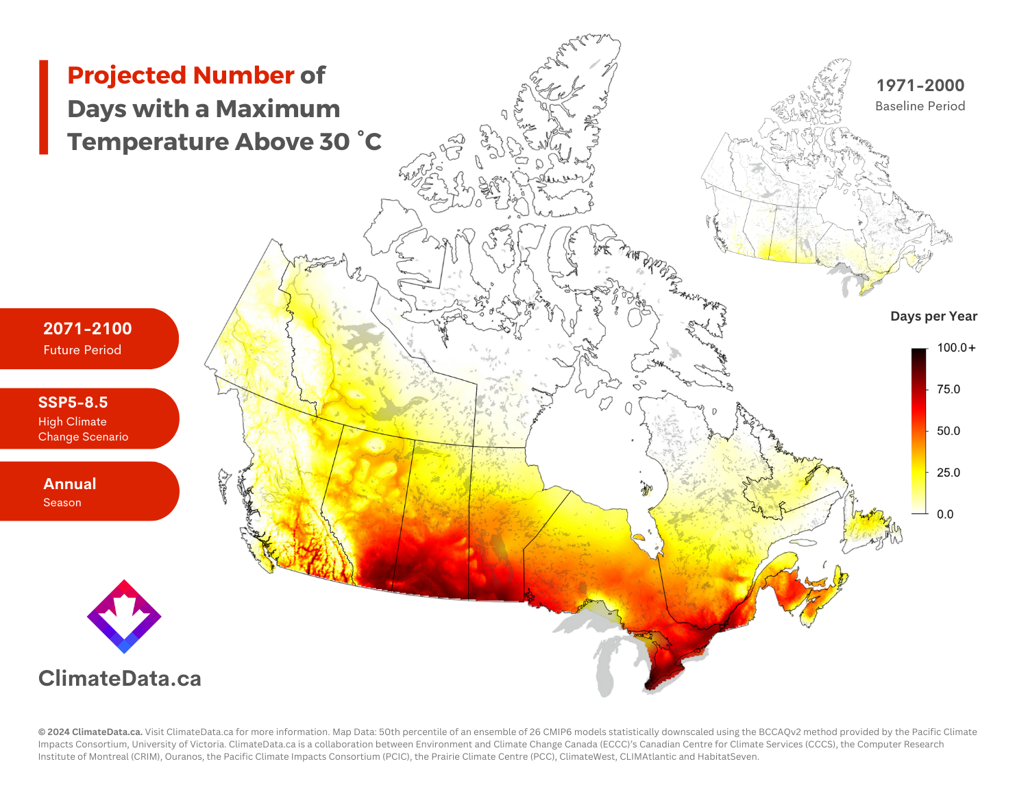
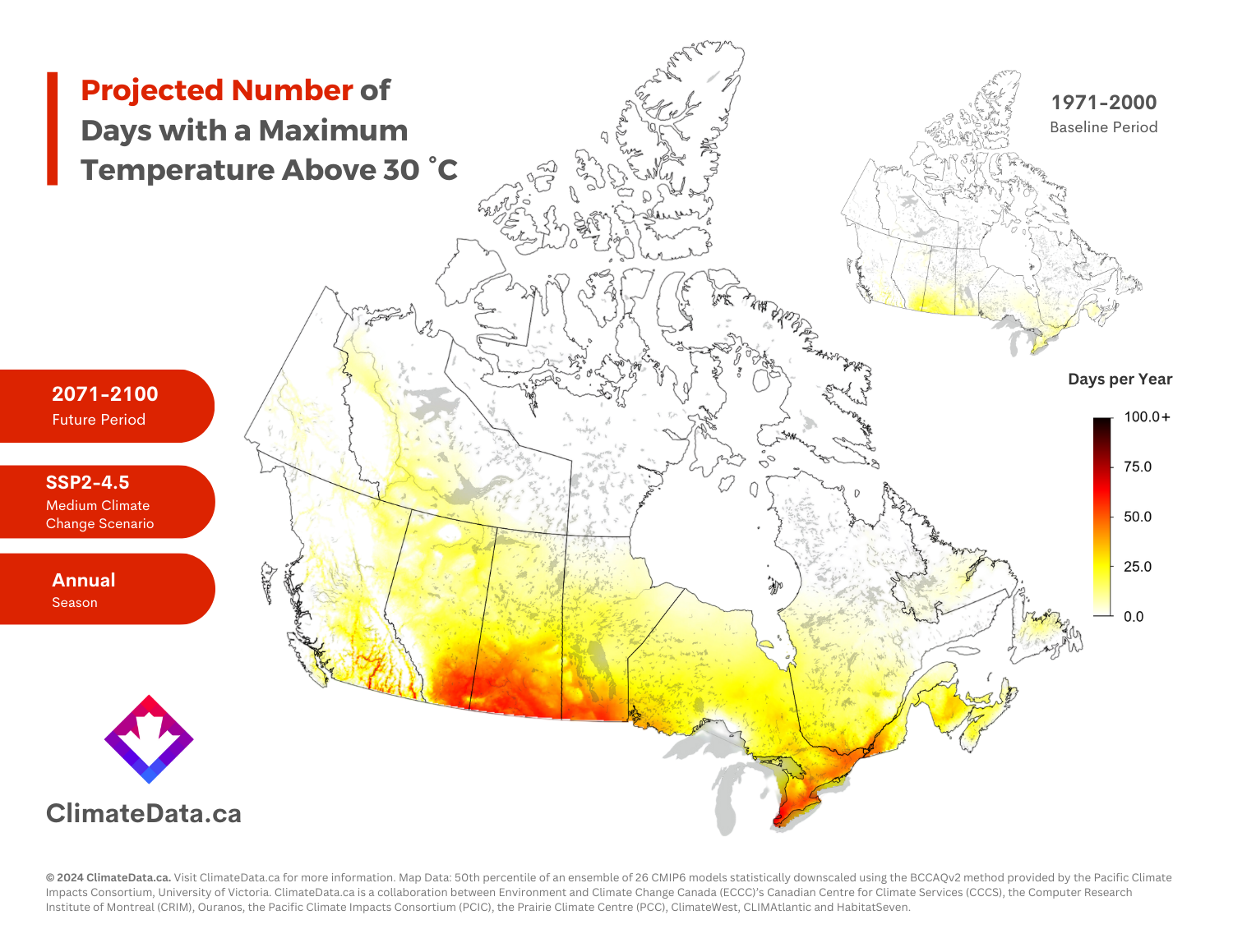
Map of the Month: Days Above 30°C

In this series, we take a deep dive into the many climate change maps available on ClimateData.ca. This month, we are focussing on maps showing projected changes in the number of days per year with maximum temperatures above 30°C (86°F). The number of these “hot days” is an important health and safety threshold, as we will discuss below.

Why Hot Days Matter

High temperatures are important. They determine if plants and animals can thrive, they limit or enable outdoor activities, define how we design our buildings and vehicles, and shape our transportation and energy use. However, when temperatures are very hot, people – especially the elderly – are much more likely to suffer from heat exhaustion and heat stroke. Many outdoor activities become dangerous or impossible in very high temperatures.

Deciphering the Map’s Message

Our first map contrasts two periods: the number of >30°C days under the historical baseline (1971-2000) captured in the inset map, and the projected future (2071-2100) number of hot days under SSP5-8.5, the highest climate change scenario on ClimateData.ca. To learn more about the importance of using 30-year time periods when examining changes in climate, visit our learning zone article on the subject.

The second map we are sharing today is like the first one but shows the projected number of >30°C days under the SSP2-4.5 scenario.

On ClimateData.ca, SSP5-8.5 is the scenario with the highest amount of climate change by end of century. In contrast, SSP2-4.5 shows less climate change, and is the “moderate” emissions scenario on the site. Not shown is SSP1-2.6, the lowest emission scenario on ClimateData.ca. To learn more about emission scenarios, please visit our learning zone article on the topic.

Map Insights

The comparison between the baseline period and two different future scenarios shows very clearly the potential for substantial climate changes across the country. The baseline map shows that places like the Canadian Prairies and southern Ontario and Quebec are used to seeing approximately 10 to 20 days >30°C per year, while the future projections show that these same regions could face over 100 hot days annually, under the high climate change scenario.

Importantly, these maps illustrate the “median” number of hot days, computed from an ensemble of 26 global climate models. The ensemble range indicates substantial variability in yearly hot day values, meaning, much like the present-day climate, some years will have many more days >30°C than others. It is important to acknowledge variability, so that adaptation plans consider the full range of potential values. Learn more about climate model ensemble in our learning zone article on the topic.

These maps underscore the necessity of climate preparedness as well as the major benefits of reducing global emissions, to ensure the high-end projections do not come to pass.

To browse more maps on ClimateData.ca, including projected days >30°C under different time periods and scenarios, please visit our interactive map page.