Exploring ClimateData.ca: Interactive Tour

Date March 20, 2026
Author Ryan Smith and Rachel Malena-Chan, Canadian Centre for Climate Services
Topics Get Climate Smart
Share this post

Introduction

ClimateData.ca is Canada’s central platform for exploring future climate information. To help you get the most out of the site, we’ve developed a set of resources that can be used in different ways depending on your needs:

1. Exploring ClimateData.ca: Interactive Tour (this article) – A step-by-step walkthrough of ClimateData.ca’s core features. It’s designed for anyone interested in exploring climate projections, whether you’re a professional planner, a student, or simply curious about how climate change may affect your community. Share this information with your group or classroom by drawing from the Explore ClimateData.ca slide deck (PDF).

2. Climate Data in Action activity worksheet (.docx) – A two-page companion activity that invites you to record numbers, fill in blanks, and reflect on their meaning. This is especially useful for students, workshops, or group discussions where you want participants to engage actively with the data.

3. Climate Foundations slide deck (PDF) – An overview of foundational climate science concepts, with links on each slide to articles on ClimateData.ca’s Learning Zone. Slides can be pulled out and repurposed to fit with your lesson plan or presentation, or the full deck can be provided to participants for an independent exploration of relevant climate literacy resources. The information covered in the Climate Foundations slide deck provides a strong baseline of understanding for those who are new to using the interactive map on ClimateData.ca. Read more about its contents here.

Together, these three tools offer flexible entry points for exploring Canada’s changing climate—whether you’re learning on your own, working in a classroom, or leading a group.

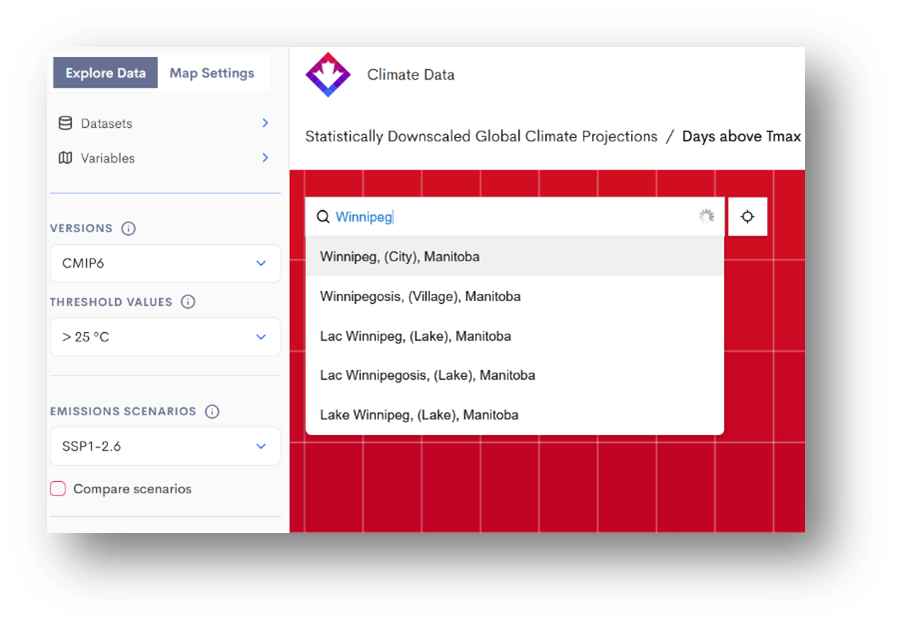
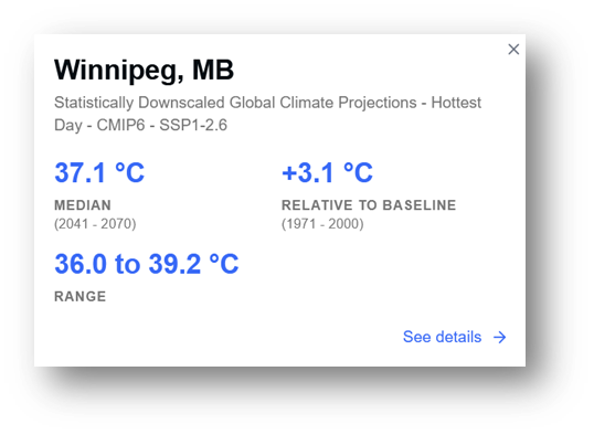
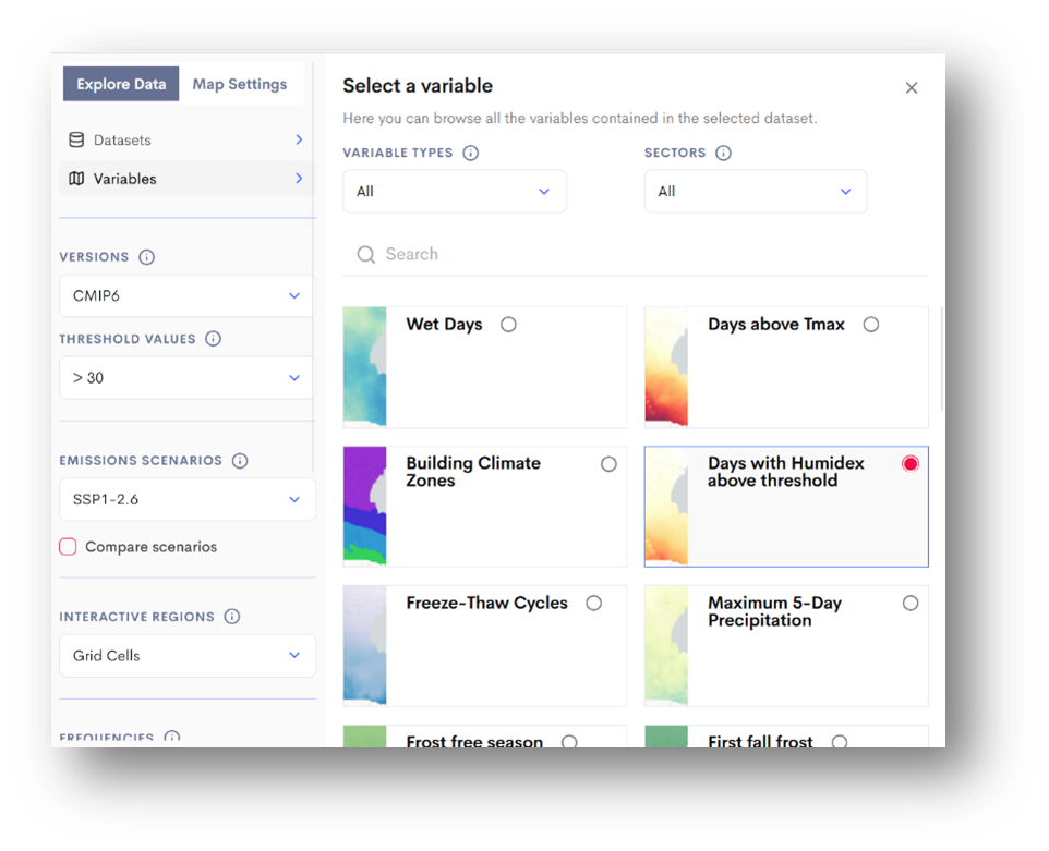
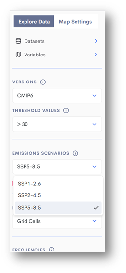
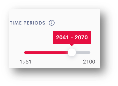
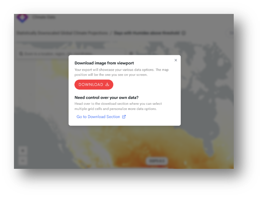
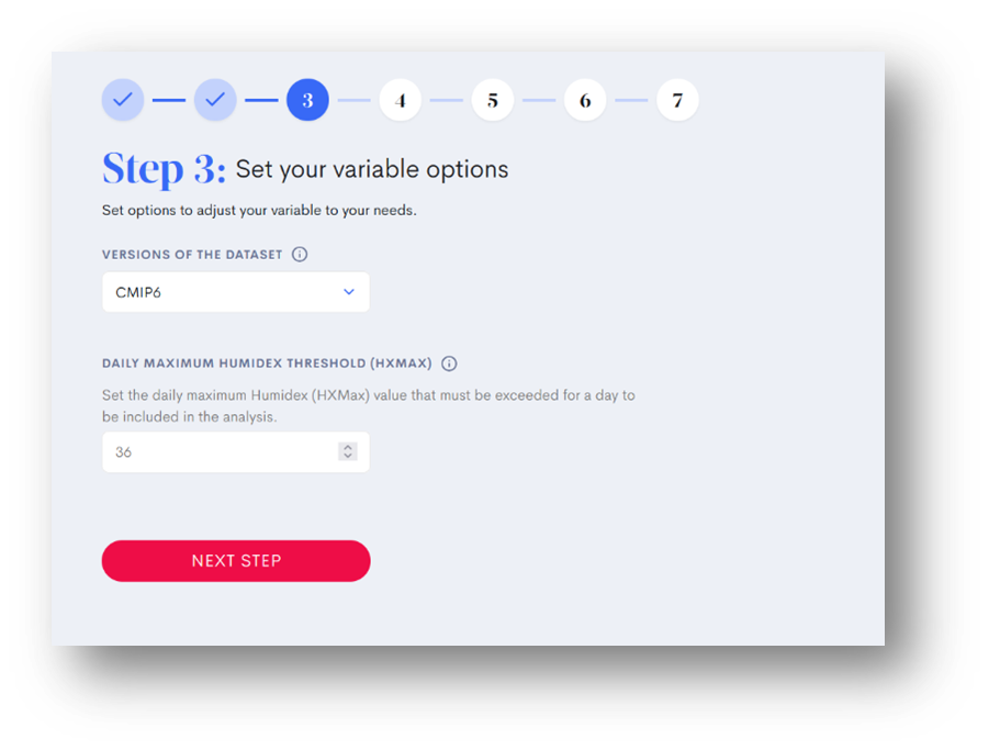
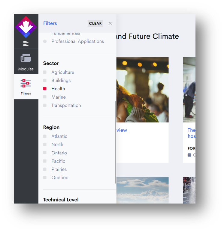
Let’s begin the tour.

Step 1: Find Your Community

Visit ClimateData.ca and navigate to the Maps page.

Use the Search Bar at the top of the map to enter a city or town in Canada—perhaps where you live, study, or conduct research.

NEW You can now also search by latitude and longitude. Search by postal code will be added soon.

Step 2: Pause and Understand What You’re Looking At

This is the most important step of the tour—take your time here. When you search for a community, the map zooms in and a popup appears with climate data. Understanding this popup is key to making sense of everything else on ClimateData.ca.

The popup title tells you four things:

  • Dataset: By default, you’re seeing data from the Statistically Downscaled Global Climate Projections (the M6 dataset). This uses advanced methods to translate coarse global climate model results into high-resolution (~6 x 10 km) data across Canada.
  • Variable: The specific climate measure being displayed. By default, it’s “Hottest Day,” but you can choose from many others. Use the ⓘ icon at the top of the map to read about each.
  • Version: The climate model generation being used. Currently, CMIP6 is the default.
  • Scenario: The greenhouse gas pathway being represented. By default, SSP1-2.6 (a low-emissions future) is shown, but you can switch to higher-emissions futures.

The popup numbers show:

  • Median: The middle value from 26 climate models (an “ensemble”), averaged over 30 years (e.g., 2041–2070).
  • Range: The spread across models, shown by the 10th–90th percentile.
  • Change from baseline: How the future period compares to 1971–2000.

That’s a lot of information. Don’t worry if it feels dense—this is the foundation of how ClimateData.ca works. If you want to go deeper, the Learning Zone has short explainers on:

Step 3: Selecting a variable of Interest

From the Variables menu, select Days with Humidex above threshold. These interactive maps show the average number of days per year with a Humidex value greater than one of three thresholds: 30, 35, or 40.

The Humidex is a familiar metric in Canada, commonly used in public weather forecasts to describe how hot it feels. It combines air temperature and humidity, which provides a more accurate indication of heat stress than temperature alone. This makes it especially useful for planning in sectors like public health, recreation, agriculture, and infrastructure.


For the remainder of the tour, let’s assume that our primary interest is related to Public Health.

💡 Pause & Learn More

→ Read: “Humidex Projections on ClimateData.ca” 

🔍 Reflect:Why might Humidex be a better measure of heat-related risk than temperature alone?What differences do you notice between the maps for 30°C, 35°C, and 40°C thresholds?

Step 4: Exploring the Dimensions of Change

ClimateData.ca lets you explore how climate variables are projected to change under different emissions scenarios. Because many of the drivers of climate change—such as future energy use, land management, technological advances, and climate policy—are uncertain, climate projections must account for multiple possible futures.

To do this, climate scientists use a set of standardized pathways called Shared Socioeconomic Pathways (SSPs). Each SSP represents a different combination of global development and greenhouse gas emissions, leading to varying levels of warming by the end of the century.

💡 Pause & Explore

→ Read: “What Are Socio-Economic Pathways?” 

🔍 Reflect:Toggle between SSP2-4.5 (medium emissions scenario) and SSP5-8.5 (highest emission scenario on ClimateData.ca) in the emissions scenario dropdown menu above the map. Watch how the number of days above your selected Humidex threshold (e.g., 30°C, 35°C, or 40°C) changes for your region. 

Every practitioner using future climate data will have to answer the question, “which SSPs should I consider?”  To do so, the practitioner will first need to answer a number of questions, e.g., What components of my project are vulnerable to climate change? What level of risk am I comfortable taking? What is the lifetime of my project?

Next, try adjusting the time period slider. This allows you to view projections up to the year 2100:

  • 2041–2070 (often referred to as mid-century)
  • 2071–2100 (end-of-century)

Observe how the projected number of days above your chosen threshold increases over time. You may notice only modest changes by mid-century, followed by much sharper increases later in the century—especially under higher-emissions scenarios.

💡 Pause & Explore→ Read: “Importance of Using 30 Years of Data”

Step 5: Customize a Threshold

So far, you’ve been working with pre-set variables. But what if you want to define your own? That’s where the Download page comes in. This tool lets you set custom climate thresholds and explore how extremes are projected to change over time.

For example, let’s look at Humidex >36°C, which is often used in Canada as a heat warning level.

1. From the Maps page, click the Download button, then select the Go to Download Section option.

2. In the Download tool, set your options. Input a custom Daily Maximum Humidex Threshold (HXMax) value, as shown in the screenshot.

3. Complete the remaining steps, which vary depending on the variable chosen but usually include emission scenario and percentile selection, and then enter the email address you want the data delivered to. Depending on the type of calculation, the analysis could take anywhere from 5 to 15 minutes to run.

This generates a customized projection showing how many days per year in the future are expected to exceed your chosen threshold.

🔍 Reflect:

  • How might more frequent days above humidex 36°C affect public health response planning in your community?
  • Who would be most at risk during these days, and what measures could reduce that risk?

Step 6: From Data to Decisions – Health Sector

Once you’ve reviewed your Download results, navigate to the Learning Zone and check out the Health Content filter. It contains real-world case studies on climate and health, including how public health authorities have used this data to plan for extreme heat events.

💡 Pause & Explore: Read the Extreme heat waves in Québec case study to see how climate data was integrated into emergency response strategies.

🔍 Reflect:

  • What lessons might you draw for your own research or community?

Final Thoughts

ClimateData.ca is not just about accessing data—it’s about building understanding. With interactive maps, customizable tools, and expert learning resources, the platform invites you to explore Canada’s changing climate from multiple angles. The more you dig in, the better prepared you’ll be to ask sharper questions, uncover new insights, and imagine resilient futures.

  • If you’re ready to put your understanding into action, try out the Climate Data in Action activity worksheet, which guides you through the same steps and prompts you to fill out the sheet with information from the site.
  • If this tour was overwhelming or confusing, go back to the Climate Foundations slide deck, and find the slides that help fill in the gaps in your understanding. There, you’ll find links to further learning resources and tools to build your climate literacy.